Pyrography Basics

Henna Tattoo Moon Face Pyrography Project

Walnut Hollow Woodburner Detailer – 4

Walnut Hollow Woodburner DetailerWe are taking the Walnut Hollow Woodburner Detailer out for a test drive to discover it capabilities, advantages, and disadvantages for use in our wood burnings. Why would I buy another wood burning unit when I already have a high-end burning unit or the Walnut Hollow’s Versa-Tool?

Please click on any of the images and photos for a full-sized close-up.

The Versa-Tool uses 120 volts, 25 watts, and reaches 950 degrees F.  It has an in-line variable rheostat that allows you to set your temperature range from very pale tonal value settings to very black burns.  It comes with a five interchangeable burning tips, hot-knife tip, soldering tip, soldering wire, and three hot-stamp points – at a retail cost in the US of $29.99.

The Woodburner Detailer is a  one-temperature tool with a setting of 120 volt, 16.5 watt, 750 degrees F (398.89C) unit, and has an on/off inline switch.  It comes with just one small ball tip.  The Detailer sells for $14.99.  For this unit you can purchase extra tip profiles either individually for in prepackages sets of five.

Let’s find out why I would want a burner that has less power, less temperature variability, less tips, even if it is a half the price of the Versa-Tool.  As I work through the burning steps for this Henna Tattoo Moon Face pattern I will be commenting on how well I think the Detailer is preforming.  Please remember, this is just my opinion.


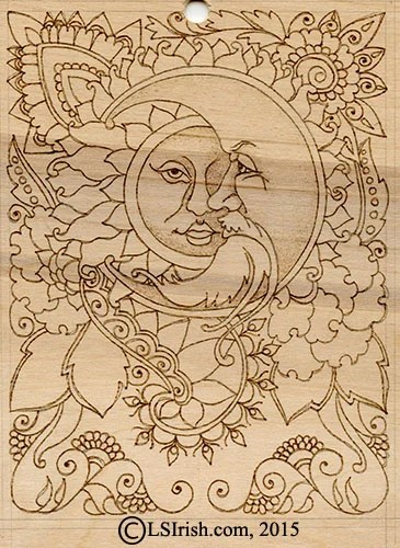
Henna Moon Pyrography Project
Walnut Hollow Woodburner Detailer – Introduction
Walnut Hollow Woodburner Detailer 2 – History of Henna Tattoos
Walnut Hollow Woodburner Detailer 3 – Tracing the Pattern

Walnut Hollow Woodburner Detailer

Walnut Hollow Woodburner DetailerStep 1:  The Detailer has the classic Walnut Hollow handle style that is 4 3/4″ long and 3/4″ wide at the top – a little thicker than a kindergarden writing pencil.  Top area of the handle is tightly ribbed to give you a strong, non-slip grip.  Above the grip the handle flares to protect your fingers from the heat of the tool tip and to prevent your hand from slipping onto the hot brass tip tube.  The on/off line switch is about 18″ from the base of the tool – long enough that the switch does not interfere with the pen’s movement, but close enough for easy reach.

Basic Hand Position in Wood Burning

Hand position in wood burningStep 2:  Your hand position in wood burning is extremely important.  As with all soldering-styled burners, the Detailer places your hand slightly farther away from the burning surface than high-end burning pens.  From the handle flare to the pen tip is about 2 1/2″, where the distance on my Optima pen from my finger grip to the pen tip is about 1 1/4″ to 1 1/2″.

With both pen styles – the Optima and the Walnut Hollow – I use a light pressure writing grip resting the pen between the first two fingers of my hand on one side of the pen and my thumb on the opposite side.

Because I want as much free-motion to my hand movements as possible I do not rest or support my hand directly on the wood surface.  The side or base of my palm never touches the wood.  Instead I extend my small finger until it touches the wood and use that finger’s tip as an anchor or balance point. I have exaggerated the hand position in this photo so that you can see how the small finger is the only part of my hand that comes into contact with the burning surface.

Hand position in wood burningStep 3:  In this photo I am showing my normal hand position.  You can see the two finger/thumb grip and in the shadowed area, right behind that grip you can see the tip of my small finger against the wood.

The only part of my hand or arm that is holding the pen that touches anything is that small finger.  This position and grip gives me a full range of motion as I pull the burn stroke.  Please note that I do not grip my pens as tightly as shown in this photo … that tight grip comes from holding my hand still while waiting for the camera to take the photo.  A better image of grip pressure is shown in the photo below.


detailer-5Step 4:  That extended small finger also lets me adjust the pen tip to use any part of the pen tip – from a very high off the wood position using just the point to a very low angle to the wood that allows the side of the pen tip to burn the stroke.


Outlining a Pyrography PatternOutlining a Pyrography Pattern

Step 5:  Plug your Walnut Hollow Woodburner Detailer into a surge protector electric strip for general safety.  Allow the pen tip to heat for several minutes to reach its full temperature setting.

Note:  In any burning session around the studio I have a practice board on my table as well as the project board.  A practice board is just a piece of scrap wood that is the same wood species as my project.  I can use that board to practice strokes, experiment with textures, and in this project check the burner to see if it is at full temperature.


Outlining a pyrography patternWith a light pressure grip, using the small finger as your anchor point, begin outlining your traced pattern lines.  As you pull these initial lines you want a slow, even motion to create smooth curved lines.  Remember a smooth, even burned stroke is more import than exactly following the pattern lines.  Those pattern lines will be erased at the end of the project.

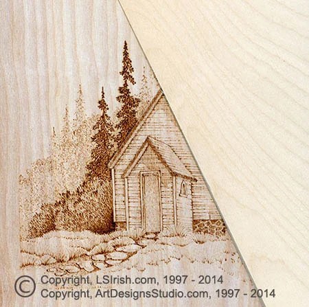
Detailer Performance: With this very first step in the burning I knew I loved the Walnut Hollow Detailer!  Look closely at the moon and sun face photo.  The outlines are all of the same thickness, and all of the same tonal depth.  There are no thin, week areas in the outline and no hot spots were I paused to turn the pen tip in the curve or at an intersection line.  And not one scorched or haloed burn that can happen with a very hot tipped pen.  That outlining looks as if it could have been printed right onto the wood.   With my first go at using the Walnut Hollow Detailer I achieved what I would consider my best outlining step ever !!! I love it !!!

If this burner does nothing more than allow me to create perfect outlines every time, it has already earn its right to be on my photography table.

Simple Face Shading in PyrographySimple Face Shading in Pyrography

Step 6:  With the outlining complete, lets see how the Detailer preforms as a shading tool.

With a very light pressure on the pen tip, I have worked a tightly packed scrubbie stroke into the two faces – my moon and sun.  The shading for both falls of your right hand side of the element.  Because the sun sits behind the moon, her face shading will become the darkest tonal value in this burn.


Simple Face Shading in PyrographyStep 7: More shading has been added to the two faces by working a second light-pressure scrubbie stroke over the shadow areas.  A third layer was worked on the sun face in the right side eye area and the right side of the mouth to gradually dark her face and push it behind his un-burned nose and mustache.

The eye pupils, and the inside of her open mouth was burned to a dark tonal value using a simple touch-and-lift dot pattern.  By allowing the pen tip to rest for a moment on the wood the dot burns to an even black spot.


Simple face shading in Pyrography
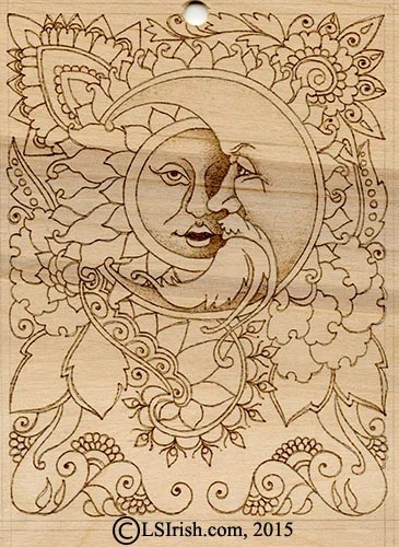
Step 8:  Here’s a close-up photo of the face shading.

Detailer Review:  Creating pale tonal values with the Detailer is done by simply adjusting the pressure on your pen tip!  A light, even moving touch creates smooth pale tonal values.  Adding layers of light-pressure strokes quickly brings the tonal values into the mid-range.  There is no waiting for the pen tip to cool as I would with my high-end burners. 

So at this point the Walnut Hollow Woodburner Detailer is creating perfectly even, smooth outlines, and a nice range of tonal values.  There is one more note here, which sadly I did not think to capture in a photo.  Even though I have been burning for about an hour at this point in the work and have created an area of dark and very dark tonal values there is no carbon build-up on the pen tip.  The tip is as bright and clean as when I began burning.

In the next posting we will be working the Henna Tattoo flowers and scrolls and adding to the facial shading.

While I work on the next posting, here are a few links you might enjoy:

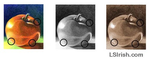
Contrasting Tonal Values – How to use black and white to create drama in your burnings.

Mushroom Pyrography Doodles – Using textures, fill strokes, and patterns to create your shading.

Tonal Value Worksheet – Create a sepia tonal value scale using your wood burner.

Walnut Hollow Woodburner Detailer – 4 Read More »

shadow and light in pyrography photographs

Color, Shadow and Light in Pyrography 3, by Lora S Irish

Over the last two days we have been exploring how light, shadows, color, and tonal value are created in a photograph and how they affect the sepia pyrography wood burning.   Today we will look at repeated tonal values, black and white contrast, and adjacent mid-tone in our gray-scale photos.  Next we will take a look at how your eye and brain sees and interrupts images.

Shadow and Light in Pyrography Photos – Day 1
Shadow and Light in Pyrography Photos – Day 2
Shadow and Light in Pyrography Photos – Day 3
Shadow and Light in Pyrography Photos – Day 4

Lora S. Irish books

repeated tonal values in a pyrography wood burningRepeated Tonal Values

A shade of tonal value will be repeated several times throughout any image or photograph. In the tomato drawing three areas that been marked that all share the same tonal value. Each of these areas would receive the same pyrography burning to keep the tones equal.

You will find similar or equal tonal values throughout your gray or sepia toned image even though those same areas show different hues in the color photo.  A medium green, medium red, and medium blue may share the same medium sepia tonal value.

black and white contrast in a pyrography wood burningBlack and White Contrast

Placing one or two areas of the extreme tonal values next to each other gives the eye a place to compare the darkest and palest tones.  The brightest highlight on this tomato lies in the upper left and is adjacent to the blackest tone of the drawing, found in the background area. These two tonal value areas set the whitest and darkest tones of your tonal value scale.

Working an area of high contrast – white against black – creates a visual boundary for your tonal value scale.  All mid-tones must fall between these two extremes.  The boundary tones do not need to be pure white or pure black; a gray-scale can be created starting with a pale gray and ending with a dark gray.

adjacent mid-tone values in a pyrography wood burningAdjacent Mid-Tone Values

In any gray scaled photo you will discover adjacent areas in two different elements that have the same tonal value. In these areas the defining line between the two elements seems to disappear. In our sample there are three areas where the body of the tomato and either the table surface or background share the same tonal value.

When two areas share one tonal value you can adjust one or both of the mid-tone values in a burning to create some contrast. Even a very small change in one area, either going a bit lighter or darker, is enough to redefine your boundary lines.

facebook coupon


How the Brain Interrupts an Image

landscape scene for pyrography wood burningNotice that I did not say how the eye sees an image. The eye receives information about an image or photo in two distinct manners, it is only when those two pieces of information are combined by the brain do we see an image. So where the eye gathers information it is the brain that interrupts that information into one image.

Inside of the eye are two receptors – the cones and rods. The cones of the eye gather information about color, it determines if an objects is red, yellow, or blue. The rods, the second eye receptor, evaluates the amount of light each area is receiving; the rods create the gray-scale tonal values that we use in pyrography. Our sample photo for this section is a wooden hill just after sunrise.


landscape pyrography wood burning Color Receptors – Cones

The sample photo has been altered to remove as much shading as possible while emphasizing the color hue of each area. The gray-green leaves of the forest are now broken into areas of yellow, yellow-green, deep green, and blue. The tree trunks show greens, reds, and yellows.

You can see the colors contained in light when you view a rainbow created through a prism, called a spectrum. Each color in the spectrum has its own specific wave length. When light strikes an object most of those color waves are absorbed by the object. Those that are not absorbed bounce off the object to be received by our eye.

So the color of any object and therefore the color that our eye cones receive are the light wave lengths that the object rejects. We don’t see green leaves, we see the green light waves that have bounced off of the leaves.

gray scale landscape for pyrography wood burningSepia or Gray Scale Receptors – Rods

What the tonal value receptors, the rods, see is equivalent to a sepia or black and white photo. Rods record the amount of light an area is receiving – whether it is in pure highlight or the darkest shadows.


landscape pyrography wood burningCombining the Cones and Rods Images

The brain combines the information sent by the cones and rods to create one image that has color hues and tonal values.

In the photo sample, left, the color image has been superimposed over the sepia tonal value image, exactly as the brain compiles the information it receives. The resulting photo is an excellent copy of the original camera photograph.


Lora Irish on Facebook


Color, Shadow and Light in Pyrography 3, by Lora S Irish Read More »

Color, shadow, and light in pyrography projects

Color, Shadow and Light in Pyrography

Lora Irish Pyrography, Derringer PatternLet’s take a close look at how your photographs can be used for your next pyrography project, and how the color, shadow, and light of  those photos affect the tonal values of your wood burning.  Today we will start by defining the important terms that are used in describing light, shadows, colors, arrangements, and designs that we use in wood burning.

Shadow and Light in Pyrography Photos – Day 1
Shadow and Light in Pyrography Photos – Day 2
Shadow and Light in Pyrography Photos – Day 3
Shadow and Light in Pyrography Photos – Day 4

INTRODUCTION
As pyrographers we often use photographs as the base for our wood burning projects. Home photos of family and friends, a landscape photo of an old hip roof barn, and pets playing with their favorite toy are all possibilities for a realistic, finely shaded pyro burn.

Today’s digital cameras makes using photographs even easier as your image can quickly be uploaded to your home computer for instant printing.

Although a photograph accurately captures the scene or still life our eye does not necessary see what that photo truly caught.

During this tutorial we will look at how the human eye sees, how the brain interrupts the information from the eye, how color and gray-scale effect visual impact, and how you can learn to use this knowledge to create strong, bold, realistic pyrography images.

shadow_002FIRST IMPRESSIONS
The brightly colored silk daisies grab the attention in the photo and are complimented by the ruby-red base to the antique oil lamp. Shades of golden-yellow are found in the dried leaves, left, the golden orange background daisy, and in the oak basket. Mossy green flows through the central elements of the dried leaves, upper oil lamp base, and in the silk leaves in the basket. Overall this still life has a nice triangular layout with bold dark shadows along the floor of the elements.


Color, shadow, and light in pyrography projectsIt seems a perfect photo for the base of a pyro project until you gray-scale the image. Suddenly those bright orange and yellow flowers disappear into the background area. What appeared to be a bright highlighted area on the oak basket is now a dull mid-tone value. There are very few white highlights.

The flowers on the floor of the still life have little definition between one flower and another as all have taken one the same tonal value. This is also occurs in the basket flowers.  The gray-scale of the flowers nearly matches the gray-scale tones of the background behind the flowers.

Having gray scaled the photo we discover that it was the hue – the pure colors – of the photo that carried the visual impact.  Without the color hues the flower tonal values disappear into the background tonal values.

As we work through this tutorial we will take an in-depth look at why this bright, colorful still life is not suitable as a sepia toned pyrography painting.


Using photographs for your pyrography projectsA VERY SIMPLE DRAWING
As you look at the photo and colored pencil drawing to the left you may see a common tomato, unremarkable, and not something that you might choose as the base for your next pyro project. Yet, this simple tomato holds a fast amount of information on how your eye sees an object, how light effects the tonal value of that object, and how color and shadow interact to create an image.

In this tutorial you will explore the differences between color and tonal value; direct and reflected light, cast and reflected shadows; and how to put those aspects to use in your wood burning. This tutorial will focus on the colors, gray-scale tones, and sepia tones found in photographs and colors.

TERMINOLOGY

color wheelCast shadow – a shadow created because an object blocks the area from the light source
Contour – the curvature of a shape
Gray scale – a tonal value scale worked from white to black
Highlight – an area of direct sunlight
Hue – pure color, as red or blue, without white, gray, or black tones
Primary color – red, blue, and yellow; colors that can not be created by mixing other colors
Profile – the outline of a shape
Reflected light – a highlight created from light that has bounced off another surface
Reflected shadow – a shadow that has bounced off one surface onto the main object
Secondary colors – colors created by mixing two equal parts of two primary colors
Sepia scale – a tonal value scale worked in shades of brown
Tertiary colors – colors created by mixing two parts of one primary with one part of another
Tonal value – the amount of white, black, or gray contained in a color tone
Tones – a color with white, black, or gray added

EXPLORING THE BASICS OF YOUR PHOTOGRAPH

Foreground, mid-ground, and background boundary linesAny pyrography pattern, design, or photo will hold eight basic ingredients – form, arrangement, depth, texture, color, light, shadows, and focal points.

Form – the basic shape of each element within the design.  For this photo we have the shape of the flowers, the shape of the flower centers, the shape of the lamp, the shape of the basket, and the shape of the dark shadows on the floor of the layout.


Basic arrangement boundary lines in a photograph for pyrographyArrangement – this describes the boundary lines that hold the main elements of the design.  For our photo the elements can be captured in a triangle, making this a triangular arrangement.  The elements in this photo can be contained in a large triangle that starts on the left at the tip of the most extended leaf, to the top edge of the glass globe, and then to the blackest shadow point behind the basket.

Texture – the physical characteristics of the surface of each element – the weave of the basket reeds, the ribbing in the flower petals, and the smoothness of the glass globe.


Foreground, mid-ground, and background boundary linesDepth – includes the air space behind the elements, the elements that are deepest in the layout – background elements shown in the deep gray boundary lines, the elements that fall in the middle of the designs – the mid-range elements shown in the light gray boundary lines, and the elements that are in the front area of the design – the foreground shown in the white boundary lines.


Color arrangements in photos for pyrographyColor – the hues of each element – red, blue, or yellow primary colors.  Colors can create their own boundary or arrangement lines within your photo as shown in the rectangular arrangement of the red tones of this photo.


highlights and light reflection in pyrographyLight – those areas that are directly hit by your light source – the bright and mid-tone whites of your wood burning.  Highlights can fall at any depth in your designs.  In the photo the brightest highlight falls on the glass globe which is in the background depth area of the photo.


Shadows in a pyrography wood burningShadows – this describes the darkest tonal values of the wood burning that are created because those areas are blocked from direct light.


focal points in a pyrography designFocal Points – a focal point is the area of the design that first catches your attention.  There can be multiple focal points in any design, with one dominate point and other minor points.    The focal point of our practice photo is the bright white highlight that falls on the chimney of the lamp. It becomes the focal point because it is the brightest, purest color in the photo, because it falls in the center of the arrangement boundary triangle, and because it falls on top line of the color boundary.


Tomorrow we will work through the color wheel, color groups, highlights, reflected highlights, cast shadows, reflected shadows, and contour tonal values … see you then!


Great Book of Woodburning by Lora S IrishLora is the author of the Great Book of Wood Burning,
available at Amazon.com. For more great craft books by
Lora Irish, please visit our Book Gallery.


Color, Shadow and Light in Pyrography Read More »

mallard duck wood burning

Fading Wood Burnings

Country Church Wood Burning
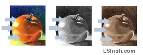
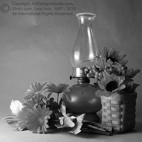
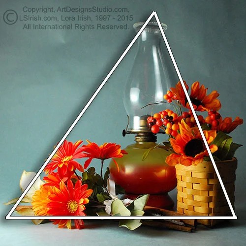
With time and age your wood burning and pyrography designs appear to fade into the wood, losing those sharp, dramatic contrasts and very pale tonal values.  Recently, while cleaning our studio, I came across several of my very first wood burned projects, which are perfect examples of how as wood ages it develops a distinct patina which directly affects to look of our wood burning tonal values.

This Country Church, right, was burned in 2004 for the Great Book of Woodburning.  It is worked on birch plywood using a variable temperature burning unit and a looped tip pen.  The image that you see is from the original scan made for this book.

Notice how clean and white the background wood appears.  The burning shows as a neutral dark brown to pale beige hue, and there is a wide range of tonal values throughout the burning.

Country Church Pyrography ProjectHere is a scan, made this morning, of the same wood burning, ten years later.    The birch has taken on a rich pale red hue and a darker tonal value in the grain lines.   With age and time, wood naturally darkens in tonal value, and the results of that darkening process is called patina.

When the wood grain is exposed to air the wood literally begins to rust through oxidation.  The minerals in the natural oils and sap begin to darken into deep orange, red, and rust tones, changing the coloring of both your wood and your wood burning.

In the 2014 scan of this Country Church pyrography you can see the red tones of the oxidized patina.  Because that patina is behind the burned lines and shading of the pyrography work, the burned  design has also taken on a reddish tone.

Since all of us wish for our pyrography projects to last the test of time, at the very start of your next project you need to consider and adjust for the patina that your wood will develop in the years to come.  Sugar pine will darken to a deep, rich orange coloring.  Your fresh white basswood will move into the yellow-beige tones, and the neutral beige of your birch will become a medium rusty-red with time.  Poplar can move into golden-yellow hues and a freshly cut piece of pink-beige mahogany can become almost black-red within a decade or two.

By knowing what patina color your wood will finally develop, you can plan ahead to work your tonal values in the darker ranges to adjust for aging.  You may also need to adjust your pale tonal values.  Notice in the two images, right, that the fine grass in the foreground, just below the church door is beginning to disappear.  The original temperature setting for this grass created a pale burn line that now is close to the patina tonal values of the wood.

Country Church wood burning projectWhile the two burned images, above, may not seem that dramatic, when I do a side-by-side comparison of the ten-year old Country Church burning against a new, fresh piece of birch plywood you can see it’s not the burning that has faded but the wood that has darkened.

You can not avoid a wood developing a darker patina with time, but you can delay it.  Which wood finish you use can change the coloring of the wood.  Oil finishes and some varnishes create a pale yellow cast, polyurethane and acrylic sealers then to be very clear.  Use a sealer that has UV light protection.

Do not hang or display your finished projects in direct sunlight, nor directly near a heat source as the furnace vent or under a high wattage lamp.

Normal accumulation of dirt and oil can added to the effects of aging.  Lightly wash the surface of your projects with a damp, slightly soapy cloth, then rinse with a lightly dampened cloth.  For heavy dirt use Murphy’s Oil Soap.  It’s excellent for both wood burnings and wood carvings.


Fading Wood Burnings Read More »

Contrasting Tonal Values

Old car wood burning by Lora IrishTonal values, the shades of sepia from pale coffee with cream to dark chocolate, create the shading colors in our pyrography work.  By planning in advance areas of your work that place one very pale tone against an extremely dark tone you can give an area dramatic contrast, impact, and added depth.

Let’s use the wood burning, Grandpa’s Old Car, as our example of how contrast adds  depth to your pyrography designs. Please click of the finished burning and pattern for full sized printable images.

In the finished wood burning you see an old, abandoned car near a foreground tree and old fence line.  This is our foreground area of the pattern.  Directly behind the car stands a small clumb of trees and a gently rising hillside, this becomes our mid-ground area of the work. In the backgroud, along the hill ridge is a barn and tree line which falls in the background area of the pattern.

For a moment take a look out your window.  Notice that those items or elements that are nearest to you are also the items that have the strongest color and shadow contrasts to them.  The closer an element is to the viewer the stronger the color hues will appear. Foreground elements have distinct white highlights and crisp dark shadows.

Move you eye to the mid-ground area of you window view.  The elements or items in this visual range still have coloration, but the colors are not longer as bright and bold.  Shadows in the mid-ground area lose their white and black tones and move into the middle range of gray or brown.

Move your eye farther into the window view, try and find some distant point.  Notice tWoodburning Free Pattern by Lora Irishhat the background areas have lost much of their coloration.  Most coloring in the background falls in the gray-brown muted tones.  There are few distinct shadows in the distant background of any view.

Air – atmosphere – is not crystal clear.  Air contains fine water particles that when viewed close up, in the foreground of our designs, are invisible.  But the farther we look into a designs as a landscape the more the water particles whiten or cloud the view.

So the farther back we look the more ‘white’ from the water particles cover the elements of the scene. You can see that used in Grandpa’s Old Car pyrography.  The barn scene that is in the background is worked in a narrow range of pale tonal values to give the effect of looking through water laden air.  The mid-ground trees, just behind the car, have more contrast in the tonal values, but those values all fall in the mid-range of our tonal value scale.  Only the foreground had dramatic tones of white and black.

The tonal value placement matches the actual tonal value ranges of each area of a landscape.

Drama can also be created by placing one white tone directly in contact with one full black tone.  Notice along the bottom edge of the car.  The wheel wells and fender area have solid black tones.  In contract the grass in front of the car, that touches the car are unburned, white areas in the design.  That black and white contrast area directly sets the car on the ground in the grass.    This black and white contrast area is so bold that it pulls your eye, over and over again, to that area of the pyrography.

Contrasting Tonal Values Read More »

Scroll to Top