Over the last few days we have discussed light and shadow, and how the eye and brain interrupts visual information as related to photographs that we use in pyrography projects. Today we will be exploring how to layout and plan your still life photos to create the strongest image possible for your wood burnings.
Shadow and Light in Pyrography Photos – Day 1
Shadow and Light in Pyrography Photos – Day 2
Shadow and Light in Pyrography Photos – Day 3
Shadow and Light in Pyrography Photos – Day 4
 Color Impact vs Tonal Value Strength
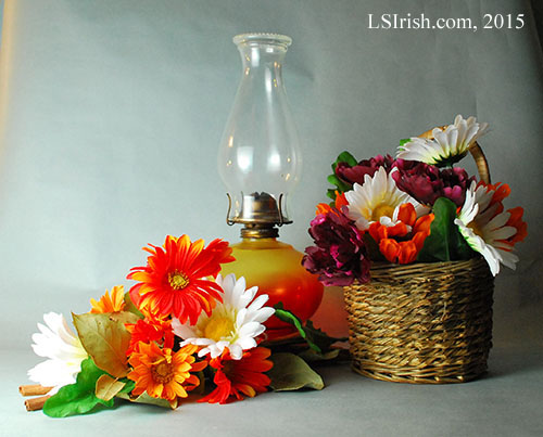
For this photo sample I have laid my arrangement on the table with my focus on tonal value instead of hue. I chose silk flowers that had strong amount of black or white to add to the arrangement.
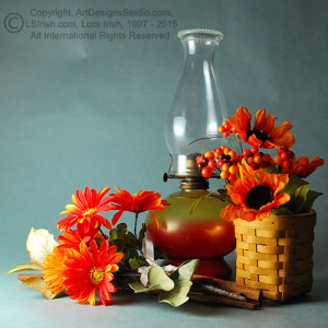
The addition of a few pure white flowers in both the foreground arrangement and in the basket adds highlight tonal value to the final photo. Compare the visual arrangement line created by the white flowers in this photo with the original photo, below, that used the red flowers for the arrangement layout. White is the purest of tonal values and therefore has the strongest visual impact.
 A few dark red flowers were also added to the basket. Since dark red is created using pure red hue and black I know that these flowers will have a dark tonal value. By adding black tonal values through these deep red flowers I can carry the visual impact from the white flowers into the deep shadow areas of the basket.
The glass globe still places some transparent glass in the final image but as the base of the lamp is color toned so that this area in the arrangement will take on a mid-tone value.
Note in the two layouts the difference in the tonal value of the background blue-gray paper. In our new photo layout I have changed the direction of the light source to create a graduated tonal value scale from one overall mid-tone value. Now the mid-tone red and orange flowers in the foreground will stand out from the pale toned background.
 The gray-scale image has a nice balance of white, mid-grays, and black tonal values. The brightest areas of the gray-scale photo are now in the white foreground petals instead of in the background glass elements. The black tones under the flowers and between the floor arrangement and basket are stronger because there are more strong areas of white with which to contrast.
In the original arrangement the strongest asset was the diagonal line of bright orange flowers. In the new arrangement color photo that line is not as strong with the addition of new flower colors – the dark burgundy and pure white flowers break the orange line.
Yet the gray-scale photo has a strong diagonal line in the same position. This new line has extra strength because the flowers now create a gray-scale – working from pale tones to the lower left, mid-tones at the center oil lamp, and dark tones in the basket.
 Finally I have sepia toned my photograph to give a clear, easy to follow map for my burning project. On to the photo I have laid a cross-hatch sepia tonal value scale. As I work this photo into a pyrography burn I can compare my cross-hatch scale to the tonal values of the photo to create a realistic styled wood burning.
Tomorrow we will finish up this look at using photographs for your pyrography, how color effects visual impact, and how the eye sees with a free Lora Irish pyrography pattern for the Derringer.


