Lettering Layouts
Relief Wood Carving
By L.S. Irish
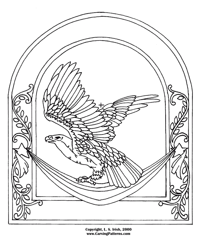
Because of the gentle arch along the top and the open panel along the bottom, this American Eagle Plaque lends itself to adding lettering to the carving. Lettering is often needed in our hobby to personalized the works we do. Birthday gifts, anniversary and wedding present, and treasure chests all benefit with the addition of names and dates.
Click on the images for an enlargement.
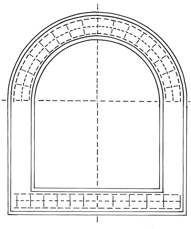
I have made a copy of the pattern, tracing only the arched panel where the lettering will appear. The upper part of the pattern arch has been divided into equal pie slices to guide the placement and angle of each letter. Please see Dividing a Circle for detailed instructions on this step.

When the upper section is completed I use my compass for sectioning the lower panel. Set the compass opening to equal the space between the pie slices in the top. Move the compass to the bottom center point of the lower panel. Mark an arc. Move the compass point to where the arc intersects your pattern line and mark a second arc. Repeat across both sides of the lower panel. With a t-square or right angle triangle you can mark vertical lines from the compass intersections.
Quick suggestions for easy lettering spacing:
- Work your rough drafts for the lettering on onion skin paper. Place this transparent paper over your lettering guide and pencil in each word. Once the basic outline is complete you can cut apart the individual letters and tape them back into position to even up your spacing.
- When the spacing has been visually evened you can fold the onion skin paper in half matching the beginning of the first letter to the end of the last letter. Crease the center fold then place that fold over the center line of the pattern. Your name or phrase will be perfectly centered to the design.
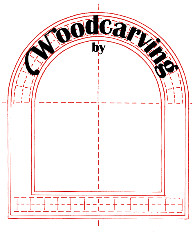
- For arched lettering as in the sample right I will first write the word or phrase on onion skin paper along a straight line. Now I can fold the paper in half to find the center point. Next cut the word apart into individual letters. These can be centered and taped, letter by letter, into position over the arch lines directly to the pattern paper.
- Signcrafting techniques teach that not all letters get the same amount of space along the line. Most letters do equal one space wide. However “E”, “F”, and “J” only get 3/4 space. “I” is usually 1/2 space. “M” and “W” receive 1 1/4 to 1 1/2 spaces. Note in the sample to the right the “o”, “d” , “c”, “v”, “g”, and “r” are all the same width . The “i” is half the size of the other lower case letters where the “W” is nearly twice the size. Spaces between words should equal 3/4 the size of one lettering space and punctuation marks are allowed 1/4 space.
- Use different styles (fonts) of lettering for different areas of writing. Again in the sample I have used a basic “thick and thin block” lettering for the word “Woodcarving” but changed to a formal script for the name. By changing font styles you can change the emphasis of the word. In this case one word tells what I do and the other word says who I am.
- Change the height of the lettering to change emphasis. If the sample is to be a shop sign for the craft shows I would want the word “woodcarving” the largest. This is the most important message I have to convey to the shopper. My name then would be carved at a shorter height. For a wedding plate you would want the names “John and Mary” carved larger than their wedding date, “June 1, 2000”.
- Change the direction of the lettering to change emphasis. Place some of your words on an angled slant or in an arch. Not all lettering has to be straight across the work.
- There are vast resources of free fonts available on the internet that you can download and add to your font folder in your computer. These can then be used to type and print the words you want to carve directly from your computer, sized, and ready to trace. There are a lot of wonderful and fun styles of lettering available over the net.
Dividing a Circle into Pie Slices
Adding a font to your PC computer:
Start with putting the words “free fonts” into the search engines.
- Download the font from the website.
- Make a new folder on the Desktop to save the font zip files.
- Open the zip files. There are several zip file openers, we use WinZip. We right click on the zip file and from the drop down menu select Extract with WinZip. Save the extracted files in that new folder. Leave this folder open on your Desktop.
- There can be several different file types in the zip package, you are looking for the ones that end .tt or .ttf (true type font).
- On your Desktop right click “My Computer”.
- In the drop down menu click on “explore”.
- In the new window click on drive [C].
- In the drop down folders click on “windows”.
- In the drop down folders double click on “fonts”. The fonts that are in your computer will open in a window to the right.
- Now go to the new folder on the Desktop. Right hand click on the .ttf files and chose “cut”. Move the .ttf files only, ignore any other files in that folder.
- Move to the font folder on the right that is opened in My Computer and “paste”.
- When you have “cut and pasted” the new fonts into your computer you can delete the new folder on the desktop. Now when you open your graphic programs or word programs you will have new lettering styles available to you ! If I am downloading several fonts at one setting (15 or more) I will restart (reboot) my computer after this operation.