On sale through Dec. 31st, 2022 For a limited time get a free bonus book, signed by Lora Irish with your Thumb Drive order at ArtDesignsStudio.com This week’s book is the Great Book of Wood Burning – Edition 2, a $22 value.
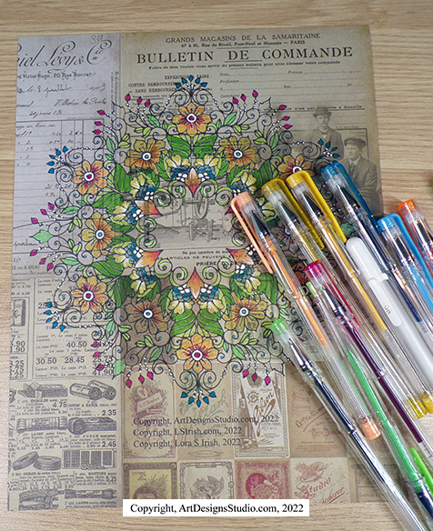
Collage is the art of using small scraps or pieces of paper, fiber, and printed material to create an image. Its a favorite for scrap booking, altered art, and fine arts. It can also be used for your wood and gourd crafts.
ArtDesignsStudio.com and LSIrish.com are affiliates of Amazon.com. Your purchases through these links helps me to keep LSIrish.com blog free for your fun. Thank you for your support!
Mulberry and rice papers have little to no grain. Instead they have a random fibrous base that allows the papers to bend, and adjust to the surface upon which they are applied. They are often semi-transparent which allows the media to show through the paper fibers – you don’t lose your wonderful wood grain of your basswood slab when you lay printed mulberry paper over top the surface.
Plus! They can be used with your home printer. It is so much easier to print a complicated mandala pattern on art paper and then glue that paper to your board, then to try and trace each and every line of the design.
Acrylic-based glues and pastes keep the printed paper from becoming water saturated, which will cause the paper to buckle. Try Yes! Glue, or PVA bookbinding acid-free glue instead of Elmore’s.
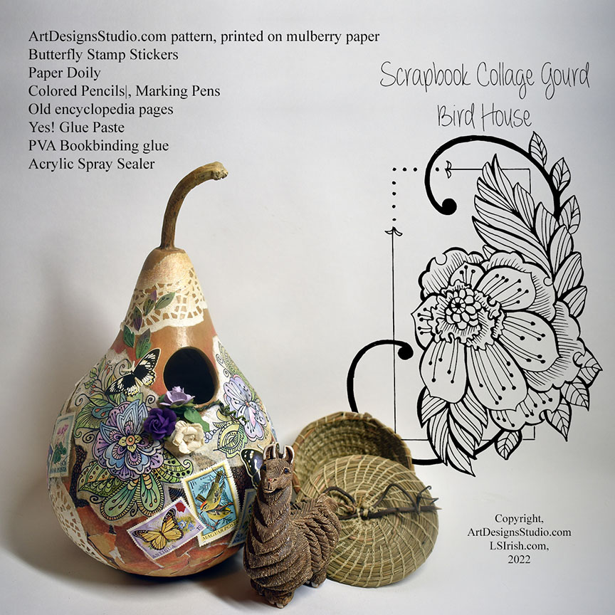
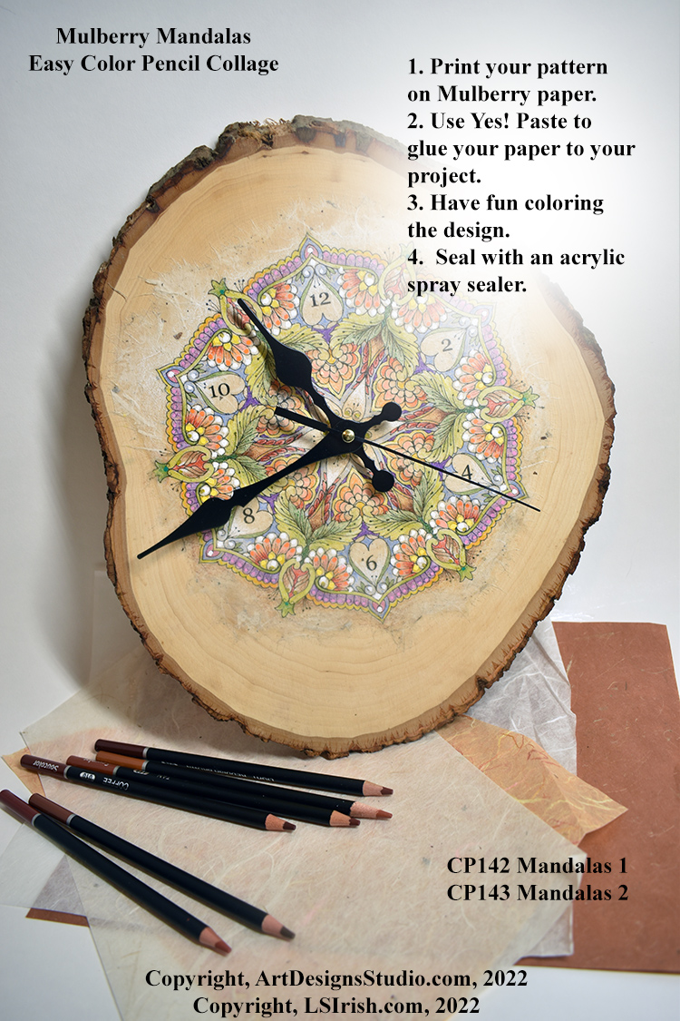
I have also posted a new E-Project for creating a Mulberry Paper covered collage wood box, with step-by-step instructions. Currently, July 13th, 2022, there is a Try It Before You Buy It free mandala pattern for the clock shown below posted on ArtDesignsStudio.com’s homepage.
This is a 1/2″ thick, end slab of basswood. Sand the slab with 220-grit sandpaper and remove any dust. Measure for the center point to create the 3/8″ hole needed for the clockworks. Print your free pattern on Mulberry paper. Use YES! glue with a palette knife on the back of the paper. Center the mulberry printed pattern over the clock hole and with your fingers gently rub from the center out on the paper to remove any air bubbles. Let the basswood collage slab dry overnight, then color your mandala with your favorite coloring agent – colored pencils, gel pens, watercolor crayons, soft pastels, and even watercolors. Seal the finished clock with acrylic spray sealer … That’s it, quick, simple, and fun.
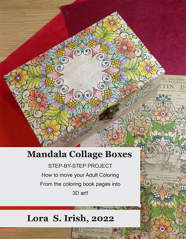
My new E-Project focuses on creating a collage covered wood craft box with a mandala design that flows over the top and sides of the box.You will learn:
how-to print the pattern to your art on mulberry paper, rice paper, or hand-crafted art paper how-to remove the pre-made box hardware how-to measure the paper to fit the inside and outside of the box how-to apply the acrylic-based YES! glue how-to roll the paper over the sides of the box how-to cut the lid free from the bottom how-to create a secret inside lid trap door.
Of course, the E-Project covers basic instructions on using colored pencils to highlight your design.
Plus, there is a large, bonus, peony design, shown printed on medium-beige mulberry paper, ready for framing.
I have been working on three brand new e-projects for my pattern website at ArtDesignsStudio.com and in today’s work of one of these new e-projects I realized I had a set of images that taught the power of working with pure color hues.
I’d like to share these images with you !!! Please click on any image for a full-sized photo.
We work with three types of color in relationship to their tonal values – pastels, pure hues, and jewel tones.
Pure hue = a color that has not been altered by the use of white, gray, or black as red, yellow, and blue. Tonal value = the amount of white, black, or gray in a color as a pale gray tone to a dark gray tone. Pastels = pure color hues that have white added as pink, pale yellow, and baby blue. Jewel tones = pure color hues that have black added as maroon, deep gold, and gunmetal blue.
Tonal values in pyrography are what we use to shade and contour an area of the design, working in sepia (brown) tones.
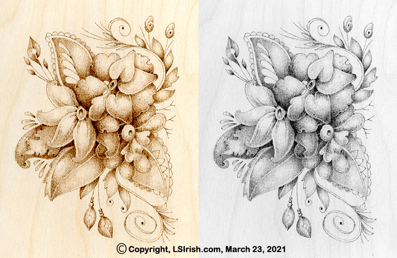
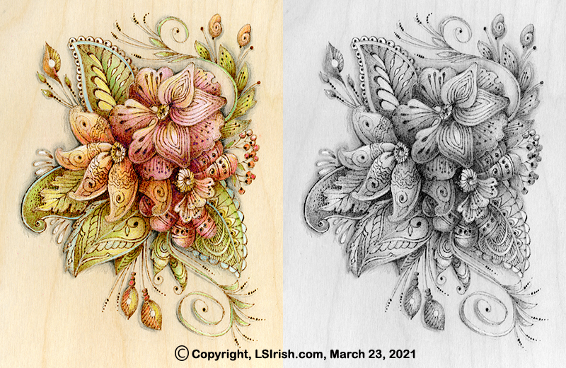
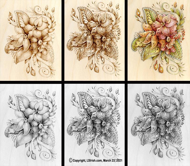
1 The images below show my pyrography shading for one of my upcoming new projects. I am working on birch plywood using my Colwood burner with my loop-tip pen and a soft, scrubbie stroke. The image to the right is the gray scaled photo of this shading which shows the black tonal value range.
2 After my shading was worked I added my fine line doodle detailing using my ball-tip pen at a medium-hot setting. Part of that detailing step included creating some solid black areas in the design. Again, to the right is the gray scale image, showing only the black tonal values. All tonal values to this point have been specifically created with the tool tip and burner temperature setting in my pyrography.
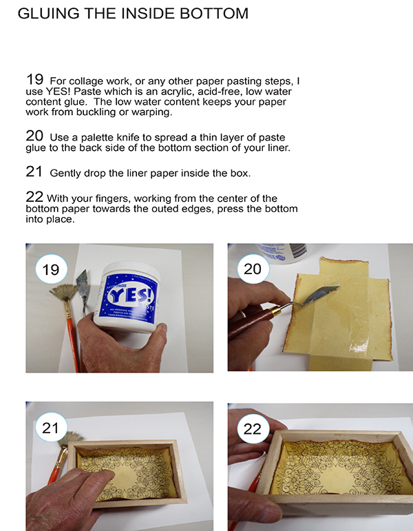
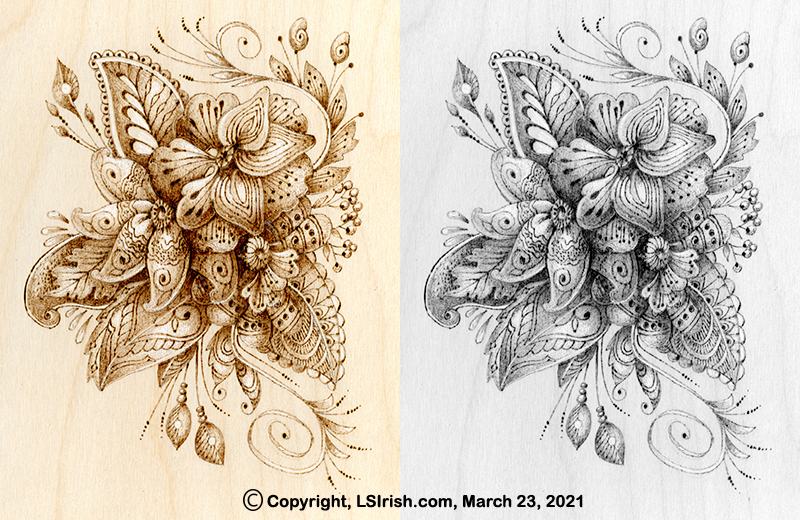
3 But what happens to that pyrography tonal value work when colored pencils are added to give individual coloring to the design. In this photo you can see the added color pencil work, using artist quality pencils which contain little or no chalk base. Inexpensive colored pencils, or school quality sets often contain chalk as the base filler which adds a white, gray, or black toning to the color hue. Artist quality pencils use either a wax base which makes the blending of the colors easy without changing the color tones or if you are using watercolor pencils no base at all.
I am working with pure hues – red, yellow, and blue or secondary and tertiary mixes of those hues. I have used some white as shown in the small left-side tear drop accents and I have worked a graphite pencil shading in the background area directly to the birch plywood.
4 Now let’s compare these three stages of work. Stage one is the simple pyro shading, stage two is the pyro detailing, and stage three is the addition of pure color hues using colored pencils. Now compare the gray scale photo of stage two to stage three and you will see that the colors have added very little to almost no tonal value to the work.
This means that all of my pyrography tonal value shading remains unchanged and therefore totally in my control even when I am laying colored pencil over the work !!!!
OK … I’m off to work on your new e-projects but will get back to you if I come across another ‘quick tip’ idea.
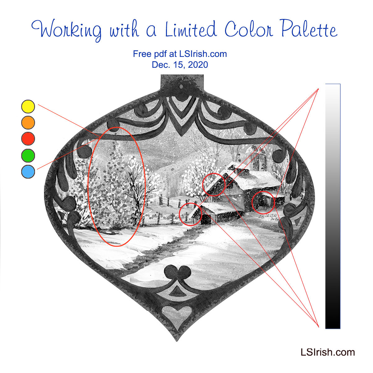
A limited color palette allows you total control over which elements in your painting become dominant; which become secondary; and which fall into the foreground, mid-ground, or background. So whether you do fine art paintings, wood carvings, or pyrography, understanding how limited palette can work for your craft makes the painting steps so much easier.
You probably are already using a limited color palette but may not realize that the way you chose your colors has a name and purpose. So let’s do a little art color theory exploration.
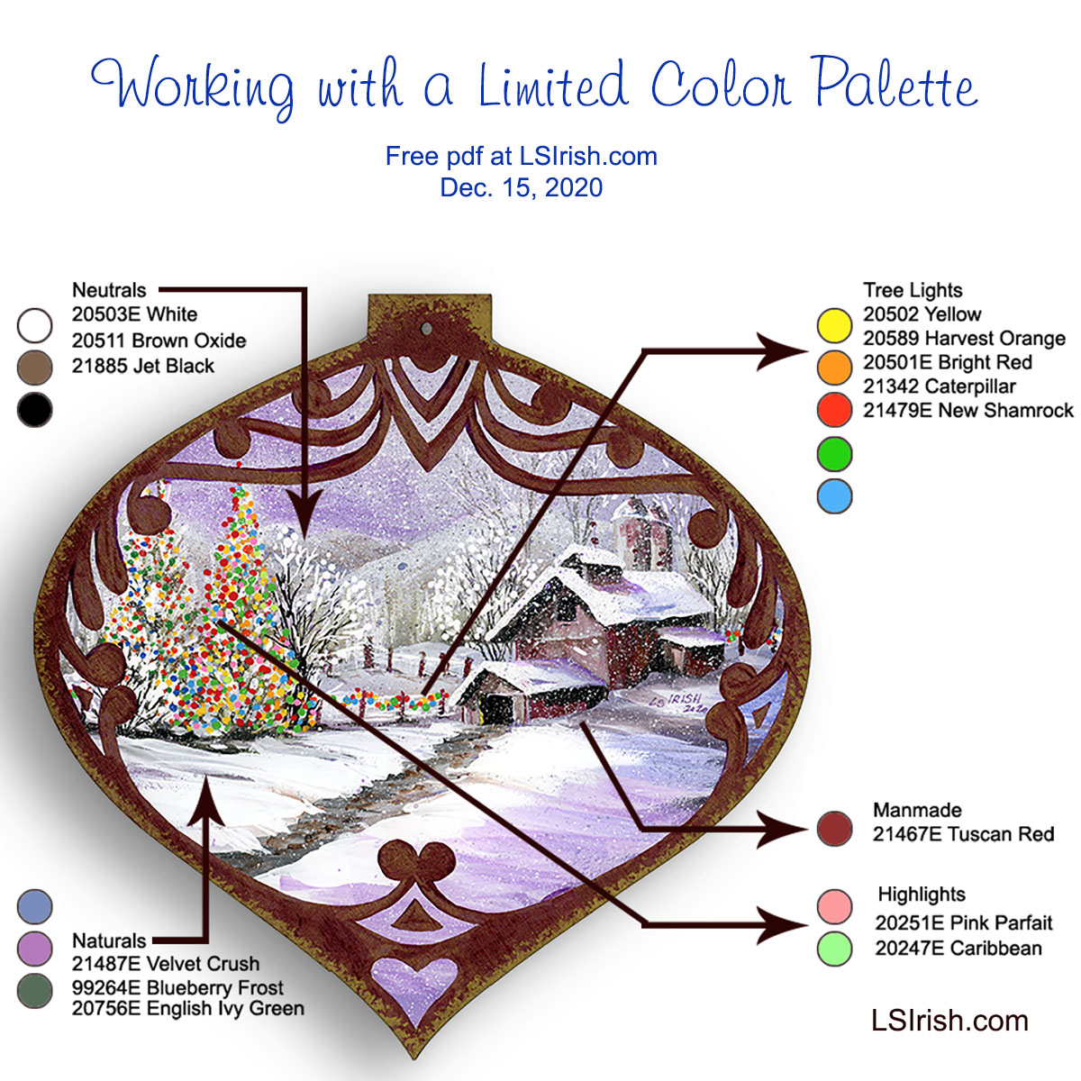
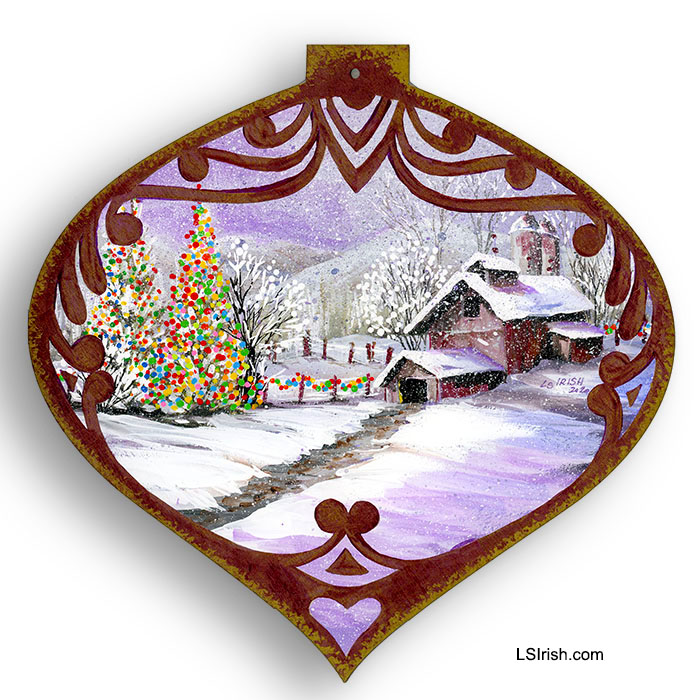
What captures your attention first? 1. The barn scene. 2. The path and background mountains. 3. The Christmas tree and fence lights.
It is the Christmas tree and fence lights that catch my eye. The barn scene becomes a secondary element which simply tells the story of where that Christmas tree is located. The reason the tree is dominate is because I have used a limited color palette.
PLANNING YOUR PALETTE Limiting your color palette does not necessary mean using just a minimal number of colors, although that is one method of creating a limited palette painting.
This painting used fifteen different colors but specifically limits where each color can be used. For this sample it means that I have carefully planned in advance where I would use my colors and what type of color – neutral, pure, or tonal value – I would use for each element.
I began by categorizing each element in the painting as a neutral area, natural area, man made area, tree lights area, and the main feature of the design. This gives me five types of elements in the pattern.
ASSIGNING TONAL VALUE PALETTES Neutrals are my blending and shading tones for my natural and man made elements. These are simple white, black, and mid-tone brown.
Naturals are my snow, sky, mountains, and trees. For this palette I chose mid-tone gray-scaled colors of medium blue-gray, medium purple-gray, and medium green-gray. All three have the same muted mid-range gray tone which unities them on the tonal value scale.
Man made elements include the barns, the silos, and the fence posts. To make these areas slightly different from the natural tones I have added a medium red-gray to my colors. This color is only used in those man made objects.
Tree light elements use a total new palette of only primary and secondary pure colors that contain no white, gray, or black toning.
Highlights of pink and pale bright green are used only in the primary element of the main Christmas tree to make it the dominant feature of the entire design.
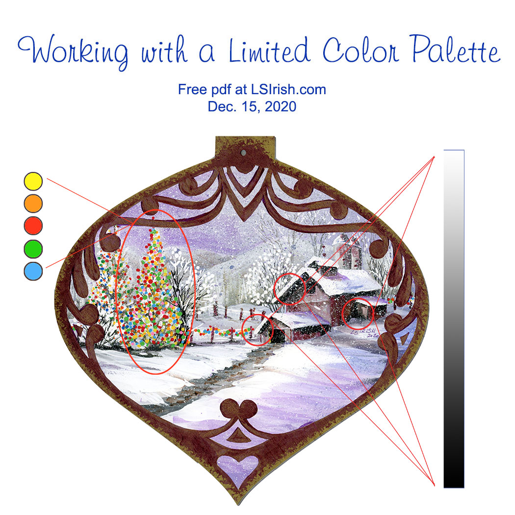
GRAY SCALE V. PURE COLOR Gray-scaled tonal value colors are used throughout this scene, with the exception of the tree light color palette. The greatest contrast of those tones are found in the barn roof overhangs where the pure white of the snow meets the darkest black tone of the barn wall shadows. The strength of this black-white contrast is most often found in the front elements of your mid-ground area.
As you come forward in a scene, into the foreground, more colors can be distinguished and therefore there are less black-toned elements. A foreground tree trunk has shades of brown and gray where a mid-ground tree trunk tends to lose that coloring therefore going into the black-tones.
Background scene elements tend to be in the white-toned area of your colors. Distant trees, mountains, and the sky area of worked in the pale white-gray tones.
PURE COLOR TONAL VALUES Pure colors as primary and secondary hues have no added white, gray, or black tone and therefore no real tonal value.
Those bright pure colors become mid-toned with only as much visual impact to the design as the background mountains. In the gray scaled painting what has become dominant are the areas of greatest tonal value contrast – those areas where the blackest tones lies directly against the brightest white tone.
Home Sweet Home- Jewel-Toned Dark Value Palette This Home Sweet Home hen uses a limited palette of only dark-toned valued colors – dark red-brown, dark green-blue, dark yellow, and dark brown. The dark toned colors are often called jewel tones. As a folk art design the elements in the pattern are simple and a very limited color palette emphasizes that simplicity. Pattern available in Hens, Roosters, and Chickens
Snow Day My final example of limited palette coloring for your wood crafts uses only primary and secondary colors. No tertiary hues are used. Since this is a wood burning this small wall heart was painted using watercolors which allow all of the sepia burning to show underneath the hue. The full tutorial and pattern are found here …
WHAT DOES THAT MEAN FOR OUR PAINTING? It means that color dominates tonal value, that dramatic changes in tonal value dominate over mid-toned values, and that by choosing to limit our color palette we, the artist, decide which elements we want to have the strongest impact in the final design.
I can push an area forward by using pure color hues or I can set the element firmly in the mid-ground range by using dramatic tonal contrasts, or I can push the area into the far background by using closely related mid-toned values.
Ceremonial Mask – Transparent Wash-Tone Palette Only very water-thinned, pure color make the limited palette for this Ceremonial Mask relief carving. By only using transparent coloring and coloring without a gray-tone addition, the wood grain and antiquing remain dominant. Pattern available in Ceremonial Masks
HOW DO I GIVE EXTRA IMPACT? Our original limited palette contains only two pastel tones – pink which is red plus white, and pale Caribbean green which is green plus white. Neither of these colors contain gray or black.
Those two pastels, used only in the main Christmas tree are enough color change to separate this tree from the other lit pine tree and the fence line lights.
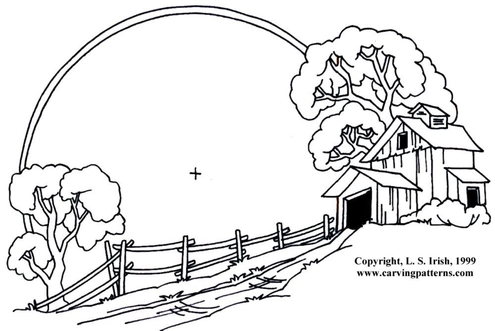
Click on the image below for a free, full-sized, printable pattern.