A limited color palette allows you total control over which elements in your painting become dominant; which become secondary; and which fall into the foreground, mid-ground, or background. So whether you do fine art paintings, wood carvings, or pyrography, understanding how limited palette can work for your craft makes the painting steps so much easier.
You probably are already using a limited color palette but may not realize that the way you chose your colors has a name and purpose. So let’s do a little art color theory exploration.
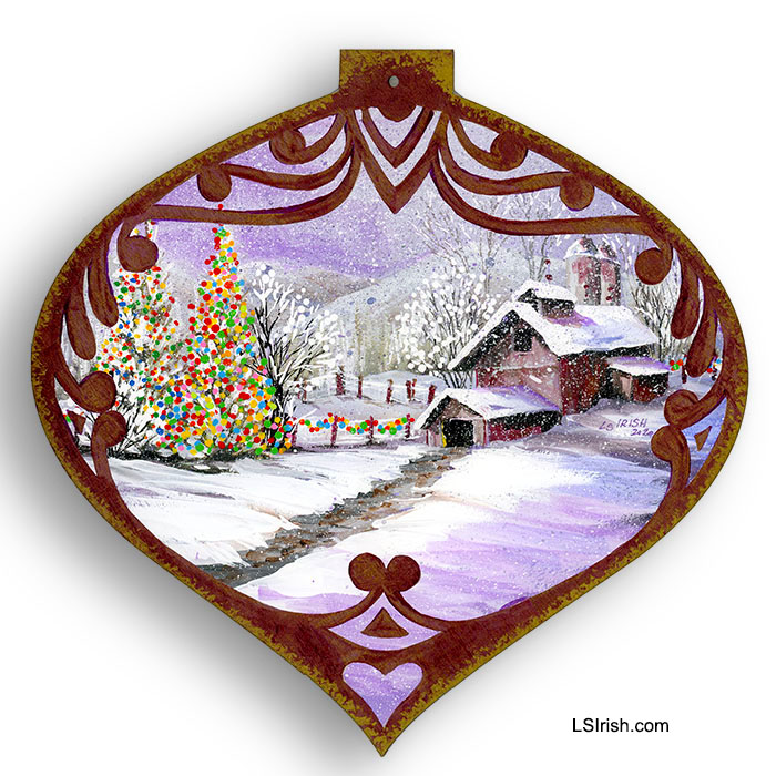
What captures your attention first?
1. The barn scene.
2. The path and background mountains.
3. The Christmas tree and fence lights.
It is the Christmas tree and fence lights that catch my eye. The barn scene becomes a secondary element which simply tells the story of where that Christmas tree is located. The reason the tree is dominate is because I have used a limited color palette.
PLANNING YOUR PALETTE
Limiting your color palette does not necessary mean using just a minimal number of colors, although that is one method of creating a limited palette painting.
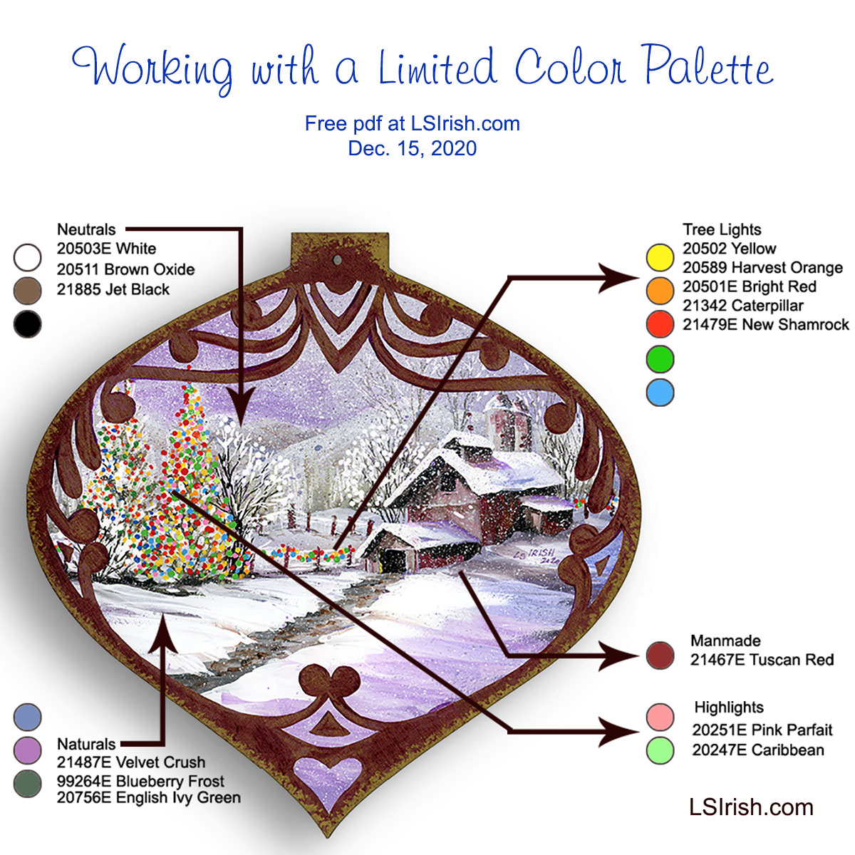
This painting used fifteen different colors but specifically limits where each color can be used.
For this sample it means that I have carefully planned in advance where I would use my colors and what type of color – neutral, pure, or tonal value – I would use for each element.
I began by categorizing each element in the painting as a neutral area, natural area, man made area, tree lights area, and the main feature of the design. This gives me five types of elements in the pattern.
ASSIGNING TONAL VALUE PALETTES
Neutrals are my blending and shading tones for my natural and man made elements. These are simple white, black, and mid-tone brown.
Naturals are my snow, sky, mountains, and trees. For this palette I chose mid-tone gray-scaled colors of medium blue-gray, medium purple-gray, and medium green-gray. All three have the same muted mid-range gray tone which unities them on the tonal value scale.
Man made elements include the barns, the silos, and the fence posts. To make these areas slightly different from the natural tones I have added a medium red-gray to my colors. This color is only used in those man made objects.
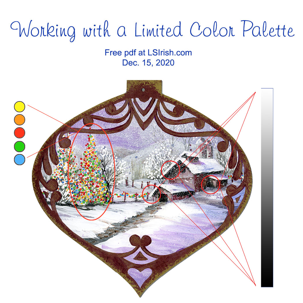
Tree light elements use a total new palette of only primary and secondary pure colors that contain no white, gray, or black toning.
Highlights of pink and pale bright green are used only in the primary element of the main Christmas tree to make it the dominant feature of the entire design.
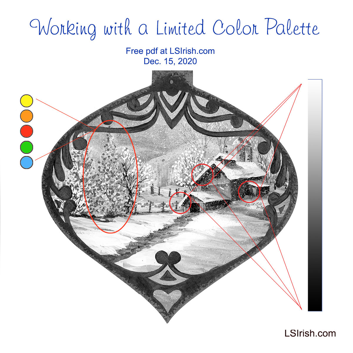
GRAY SCALE V. PURE COLOR
Gray-scaled tonal value colors are used throughout this scene, with the exception of the tree light color palette.
The greatest contrast of those tones are found in the barn roof overhangs where the pure white of the snow meets the darkest black tone of the barn wall shadows. The strength of this black-white contrast is most often found in the front elements of your mid-ground area.
As you come forward in a scene, into the foreground, more colors can be distinguished and therefore there are less black-toned elements. A foreground tree trunk has shades of brown and gray where a mid-ground tree trunk tends to lose that coloring therefore going into the black-tones.
Background scene elements tend to be in the white-toned area of your colors. Distant trees, mountains, and the sky area of worked in the pale white-gray tones.
 PURE COLOR TONAL VALUES
Pure colors as primary and secondary hues have no added white, gray, or black tone and therefore no real tonal value.
Those bright pure colors become mid-toned with only as much visual impact to the design as the background mountains.
In the gray scaled painting what has become dominant are the areas of greatest tonal value contrast – those areas where the blackest tones lies directly against the brightest white tone.
 Home Sweet Home- Jewel-Toned Dark Value Palette
This Home Sweet Home hen uses a limited palette of only dark-toned valued colors – dark red-brown, dark green-blue, dark yellow, and dark brown. The dark toned colors are often called jewel tones.
As a folk art design the elements in the pattern are simple and a very limited color palette emphasizes that simplicity.
Pattern available in Hens, Roosters, and Chickens
 Snow Day
My final example of limited palette coloring for your wood crafts uses only primary
and secondary colors. No tertiary hues are used. Since this is a wood burning this small wall heart
was painted using watercolors which allow all of the sepia burning to show underneath the hue.
The full tutorial and pattern are found here …
WHAT DOES THAT MEAN FOR OUR PAINTING?
It means that color dominates tonal value, that dramatic changes in tonal value dominate over mid-toned values, and that by choosing to limit our color palette we, the artist, decide which elements we want to have the strongest impact in the final design.
I can push an area forward by using pure color hues or I can set the element firmly in the mid-ground range by using dramatic tonal contrasts, or I can push the area into the far background by using closely related mid-toned values.
 Ceremonial Mask – Transparent Wash-Tone Palette
Only very water-thinned, pure color make the limited palette for this Ceremonial Mask relief carving.
By only using transparent coloring and coloring without a gray-tone addition,
the wood grain and antiquing remain dominant.
Pattern available in Ceremonial Masks
HOW DO I GIVE EXTRA IMPACT?
Our original limited palette contains only two pastel tones – pink which is red plus white, and pale Caribbean green which is green plus white. Neither of these colors contain gray or black.
Those two pastels, used only in the main Christmas tree are enough color change to separate this tree from the other lit pine tree and the fence line lights.
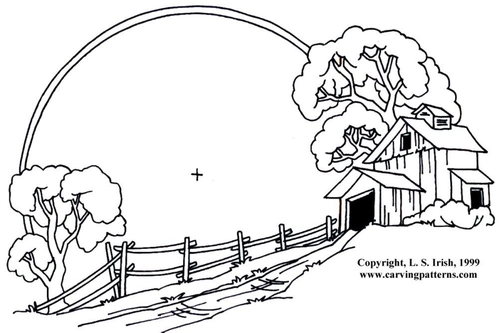
Click on the image below for a free, full-sized, printable pattern.