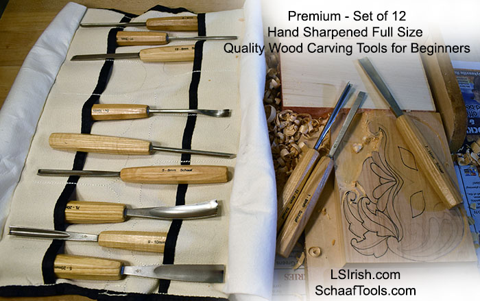
I use beginner quality wood carving tool sets because I teach beginning wood carving. I don’t use tools that are super cheap from the local big box store, and I don’t use tools that are well out of the price range for a beginner who does not yet know if they will love wood carving the way I do. I do use the very tools that I suggest for my beginners …. nice quality, good to get your stared, won’t break the bank tools.
But, OH!, Geez-zoo-flip!! I never expected to own one set of highest quality wood carving tools, that I discovered in my stocking this morning. I think I have been forever spoiled, never able to go back to ‘regular’ beginner’s tool sets again.
And (bragging here a bit) there wasn’t one set but three that will ensure a lifetime of carving fun !!!!! Ahhhh!!!!!
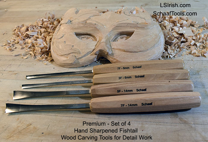
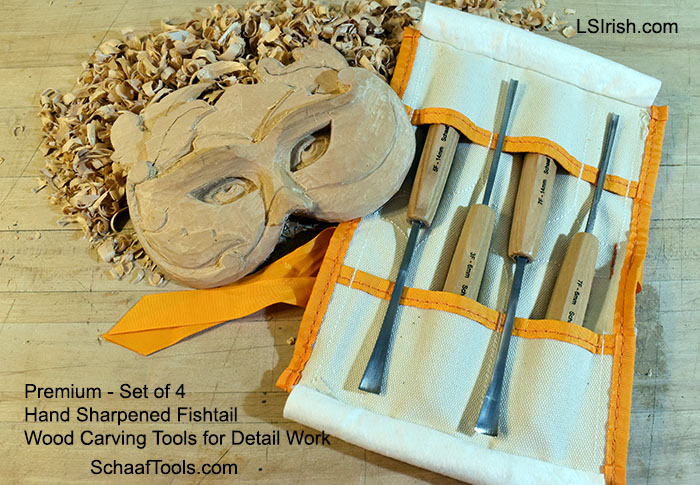
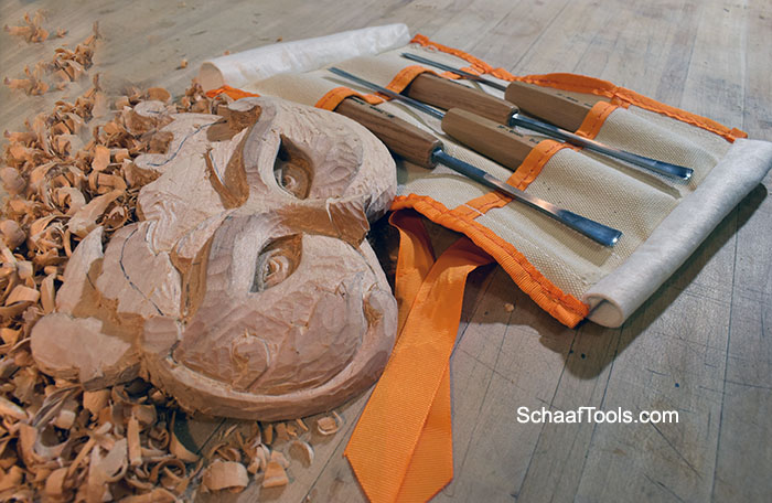
* Yes, they are high quality steel! * Yes, you can get them pre-sharpened by the experts at SchaafTools.com. * Yes, the handles fit my women’s smaller hand size wonderfully with lots of comfortable room left for our large-handed carvers. * Yes, the variety of tool profiles are just want my beginners will be using. * And yes!!! They are very affordable for any beginning carver and will last a lifetime.
So if you don’t hear from me for a while, it not because I am ignoring you … its that I am hold-up in the wood studio letting the basswood chips fly with gay abandonment!
( … and it’s OK to be envious this morning … if I were reading this I would be … grin!!!! …)
A limited color palette allows you total control over which elements in your painting become dominant; which become secondary; and which fall into the foreground, mid-ground, or background. So whether you do fine art paintings, wood carvings, or pyrography, understanding how limited palette can work for your craft makes the painting steps so much easier.
You probably are already using a limited color palette but may not realize that the way you chose your colors has a name and purpose. So let’s do a little art color theory exploration.
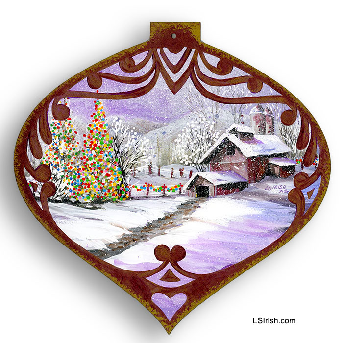
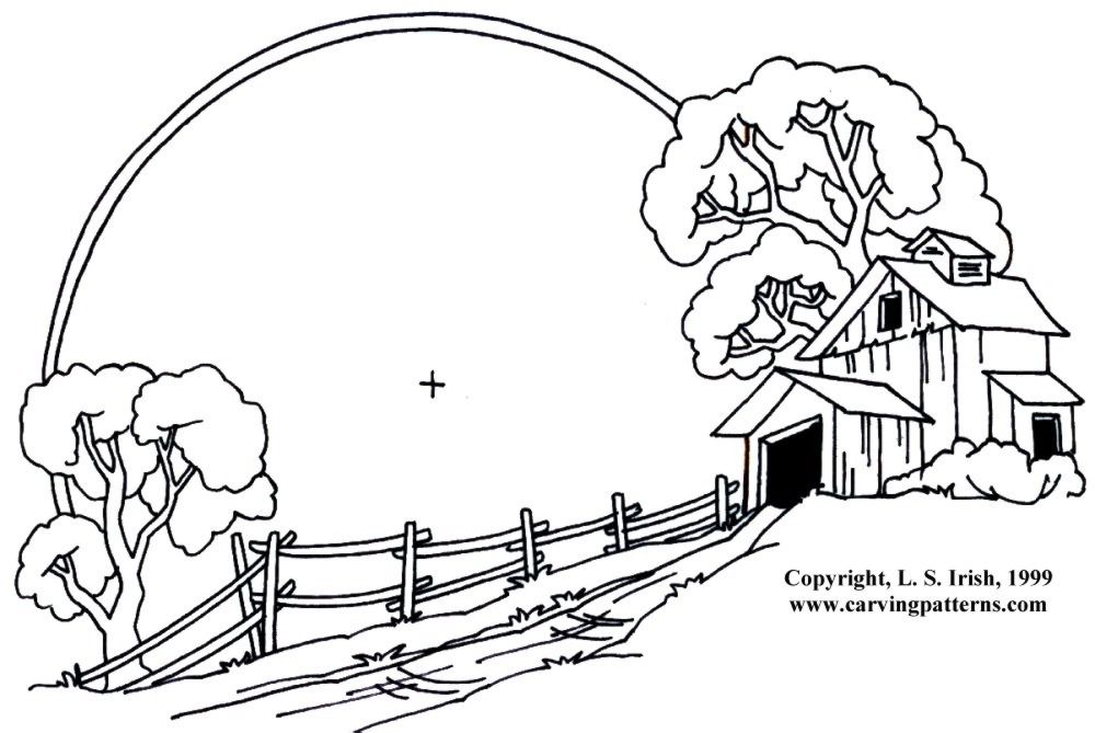
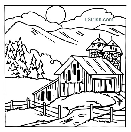
What captures your attention first? 1. The barn scene. 2. The path and background mountains. 3. The Christmas tree and fence lights.
It is the Christmas tree and fence lights that catch my eye. The barn scene becomes a secondary element which simply tells the story of where that Christmas tree is located. The reason the tree is dominate is because I have used a limited color palette.
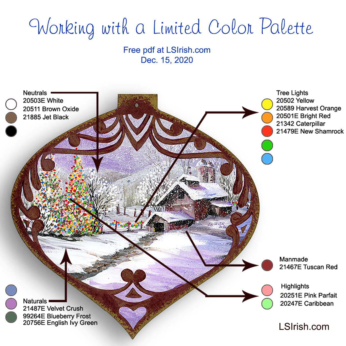
PLANNING YOUR PALETTE Limiting your color palette does not necessary mean using just a minimal number of colors, although that is one method of creating a limited palette painting.
This painting used fifteen different colors but specifically limits where each color can be used. For this sample it means that I have carefully planned in advance where I would use my colors and what type of color – neutral, pure, or tonal value – I would use for each element.
I began by categorizing each element in the painting as a neutral area, natural area, man made area, tree lights area, and the main feature of the design. This gives me five types of elements in the pattern.
ASSIGNING TONAL VALUE PALETTES Neutrals are my blending and shading tones for my natural and man made elements. These are simple white, black, and mid-tone brown.
Naturals are my snow, sky, mountains, and trees. For this palette I chose mid-tone gray-scaled colors of medium blue-gray, medium purple-gray, and medium green-gray. All three have the same muted mid-range gray tone which unities them on the tonal value scale.
Man made elements include the barns, the silos, and the fence posts. To make these areas slightly different from the natural tones I have added a medium red-gray to my colors. This color is only used in those man made objects.
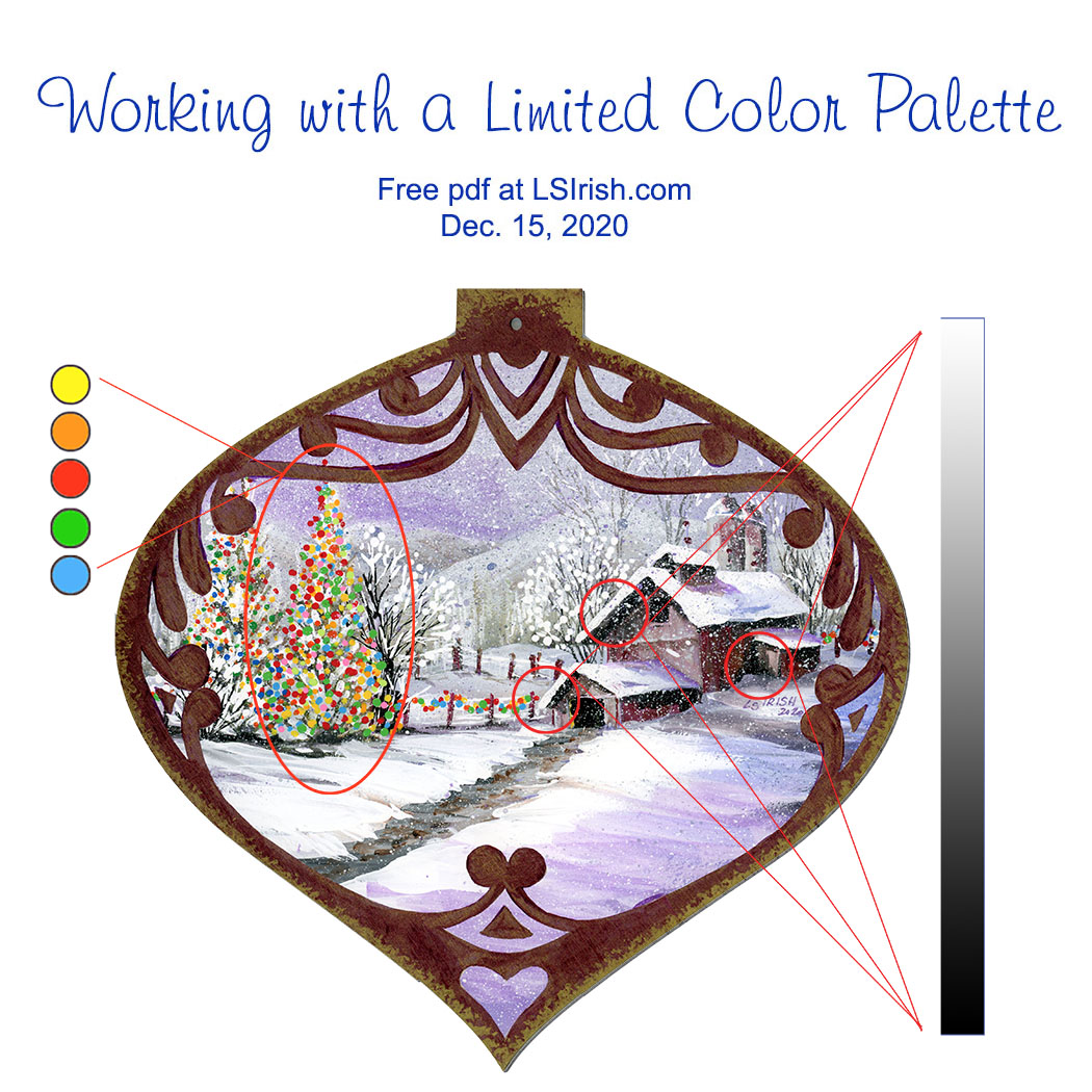
Tree light elements use a total new palette of only primary and secondary pure colors that contain no white, gray, or black toning.
Highlights of pink and pale bright green are used only in the primary element of the main Christmas tree to make it the dominant feature of the entire design.
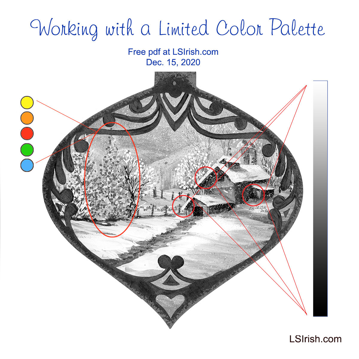
GRAY SCALE V. PURE COLOR Gray-scaled tonal value colors are used throughout this scene, with the exception of the tree light color palette. The greatest contrast of those tones are found in the barn roof overhangs where the pure white of the snow meets the darkest black tone of the barn wall shadows. The strength of this black-white contrast is most often found in the front elements of your mid-ground area.
As you come forward in a scene, into the foreground, more colors can be distinguished and therefore there are less black-toned elements. A foreground tree trunk has shades of brown and gray where a mid-ground tree trunk tends to lose that coloring therefore going into the black-tones.
Background scene elements tend to be in the white-toned area of your colors. Distant trees, mountains, and the sky area of worked in the pale white-gray tones.
PURE COLOR TONAL VALUES Pure colors as primary and secondary hues have no added white, gray, or black tone and therefore no real tonal value.
Those bright pure colors become mid-toned with only as much visual impact to the design as the background mountains. In the gray scaled painting what has become dominant are the areas of greatest tonal value contrast – those areas where the blackest tones lies directly against the brightest white tone.
Home Sweet Home- Jewel-Toned Dark Value Palette This Home Sweet Home hen uses a limited palette of only dark-toned valued colors – dark red-brown, dark green-blue, dark yellow, and dark brown. The dark toned colors are often called jewel tones. As a folk art design the elements in the pattern are simple and a very limited color palette emphasizes that simplicity. Pattern available in Hens, Roosters, and Chickens
Snow Day My final example of limited palette coloring for your wood crafts uses only primary and secondary colors. No tertiary hues are used. Since this is a wood burning this small wall heart was painted using watercolors which allow all of the sepia burning to show underneath the hue. The full tutorial and pattern are found here …
WHAT DOES THAT MEAN FOR OUR PAINTING? It means that color dominates tonal value, that dramatic changes in tonal value dominate over mid-toned values, and that by choosing to limit our color palette we, the artist, decide which elements we want to have the strongest impact in the final design.
I can push an area forward by using pure color hues or I can set the element firmly in the mid-ground range by using dramatic tonal contrasts, or I can push the area into the far background by using closely related mid-toned values.
Ceremonial Mask – Transparent Wash-Tone Palette Only very water-thinned, pure color make the limited palette for this Ceremonial Mask relief carving. By only using transparent coloring and coloring without a gray-tone addition, the wood grain and antiquing remain dominant. Pattern available in Ceremonial Masks
HOW DO I GIVE EXTRA IMPACT? Our original limited palette contains only two pastel tones – pink which is red plus white, and pale Caribbean green which is green plus white. Neither of these colors contain gray or black.
Those two pastels, used only in the main Christmas tree are enough color change to separate this tree from the other lit pine tree and the fence line lights.
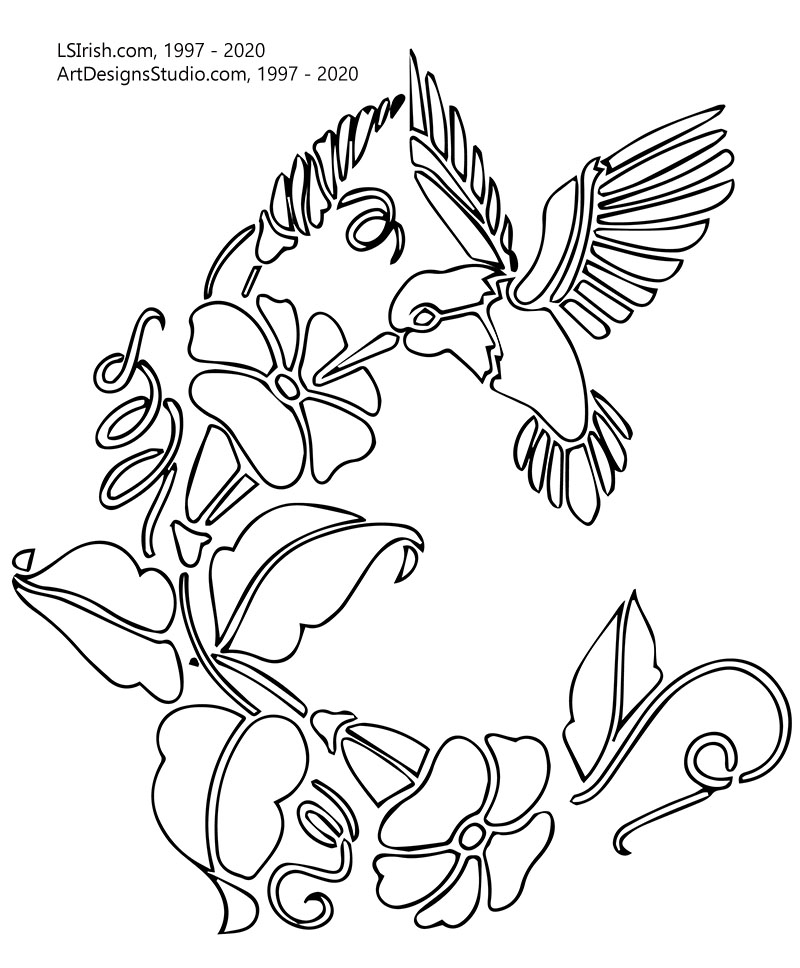
Click on the image below for a free, full-sized, printable pattern.
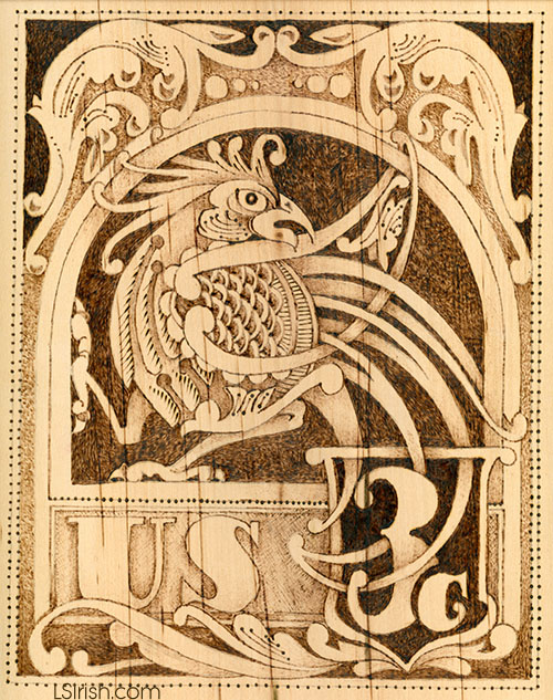
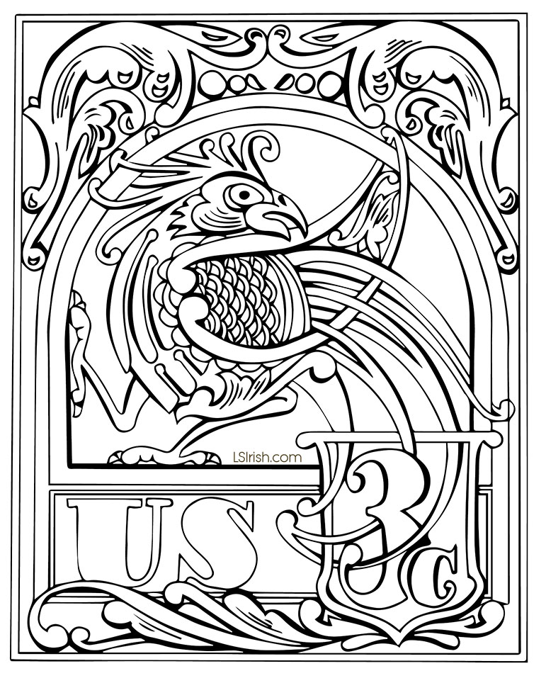
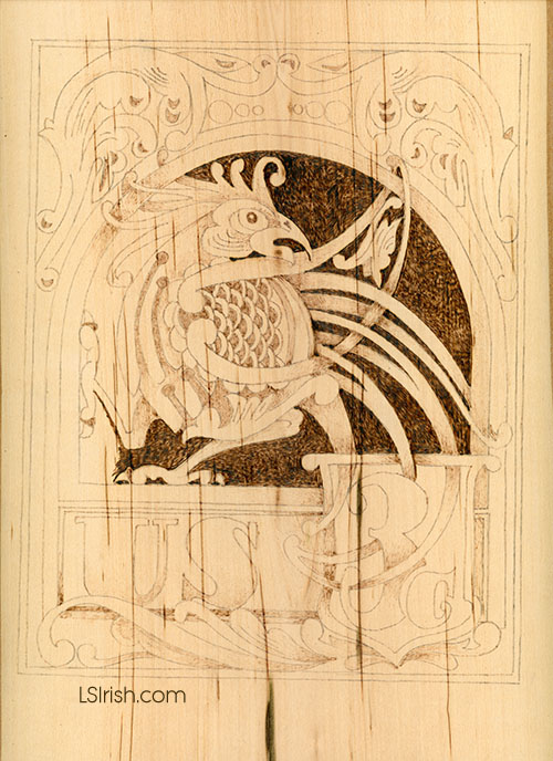
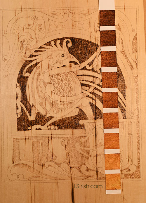
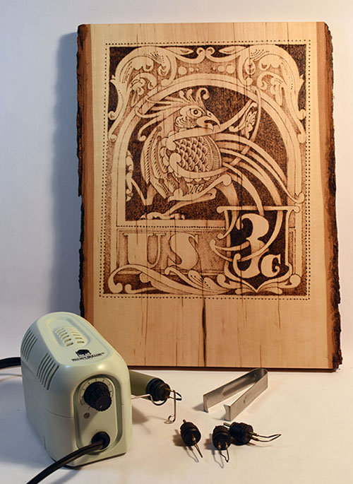
ROOSTER CELTIC KNOT COMPLETED BURN Worked as if it were an 1800’s American stamp, this Rooster Celtic Knot pattern will let us explore the basic steps used in most pyrography projects – Outlining, Mapping, Backgrounds and Voids, Texture, Strengthening, and Detailing
The pattern for this Rooster Celtic Knot is worked on a live-edge, basswood, 3/4” thick plaque that needs to be 9” x 12” or larger.
As shown in the Tracing Steps, I have allowed the extra room on the plaque to fall at the bottom of the wood, which will give me a space to add decorative cup hooks when the burn is complete.
Basswood is easy to obtain at most large craft stores. Although classified as a hardwood, this pure white, fine grain wood performs as a softwood, accepting very pale tonal values and extremely fine detail. At high temperatures and solid fills you can achieve solid black areas in your work.
The postage idea is a very forgiving subject for new pyrographers as the early 1800’s stamps, on which this is based, often were printed on coarse paper with somewhat ragged printed colors that could bleed into surrounding areas.
If your shading is a little uneven or your detail lines a little wobbly as you learn to control the wood, temperature setting, pen tip, and stroke, it will just add to the impression of an old collectable stamp.
So, relax and have fun!
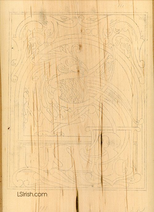
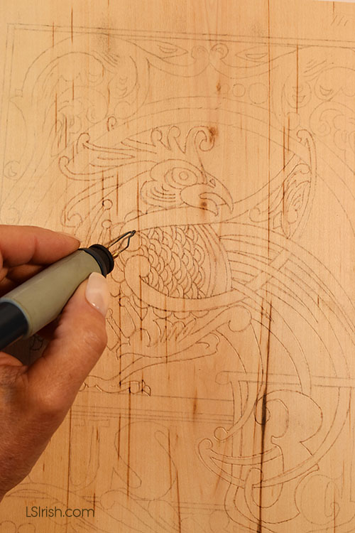
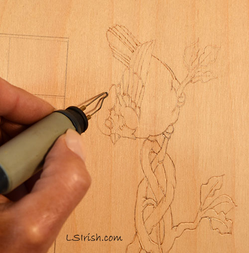
1. Sand the surface of the wood to create as smooth a burning surface as possible. Trace the pattern to the wood using a graphite pencil rub on the back of the pattern.
OUTLINE
2. Use the ball-tip pen on a low temperature setting of 4 to 5 for a very pale tonal value. Outline the tracing lines of the pattern. This light burning is to permanently set the pattern line so that your hand and work does not accidentally wipe away the graphite lines. This first outlining is not meant to be seen once the burning is complete, it is a guideline for you in your work.
Not all pattern tracings need to be outlined nor is it appropriate to do it for every burning theme. Obviously, clouds in a landscape scene do not have outlines nor do petals and leaves in a floral design. But as a beginner using a very pale outline step makes your first projects easier as you can’t lose the pattern as you work.
SAND, TRACE, & CLEAN
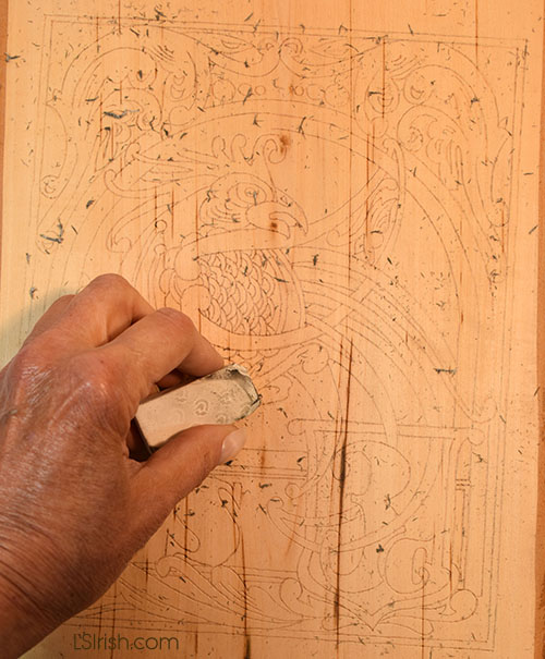
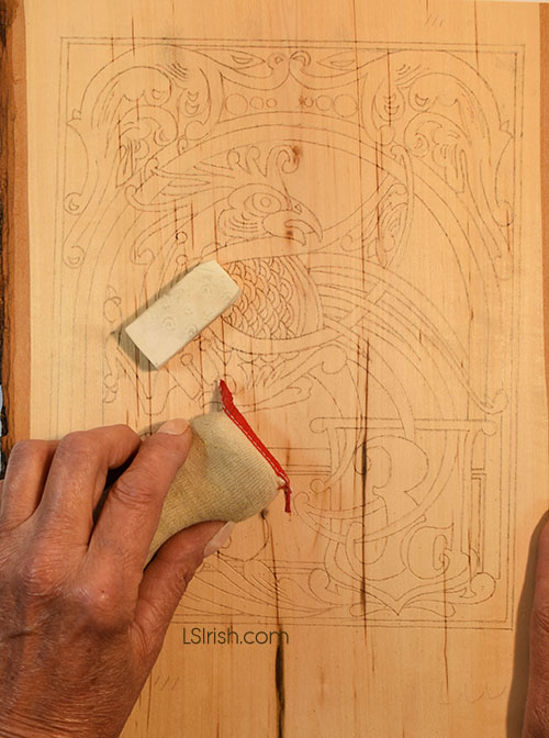
3. When you have completed the pale value outlining clean your entire piece of wood with an artist’s eraser, gum eraser, or architect’s eraser pad to remove any graphite left from the tracing steps.
Your hot tipped pen can permanently set those small graphite smudges or pattern lines into the work as you begin the burning. The outlining step just done (step 1) allows you to remove all that dirt before you begin your art.
4. After cleaning the wood, remove the eraser dust with a dry, clean cloth.
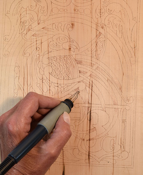
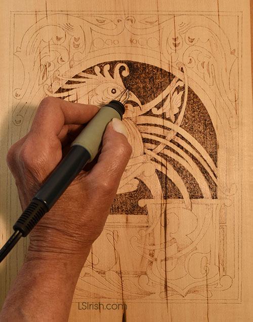
MAPPING THE SHADOWS AND SHADING
5. Mapping let’s you determine where you want your shading and shadows early in the work. Use the loop tip pen and a low temperature setting of 4 to 5, working the scrubbie stroke. Work a pale tonal value burn to those elements that lie underneath other elements. The tail feature beginning burned in the photo come from under the bird’s body. Next it tucks under the frame for the 3-cent area. Both of these areas are shaded. Where this same tail feather rolls forward and over the 3-cent frame it becomes the highlighted area that receives light, so you will be shading the frame as the underneath element.
These areas of pale value will be strengthened as you do further work on your art. This step let’s you think through where your shading will fall before you burn an area so dark that it can not be removed or altered.
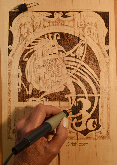
WORKING THE BACKGROUND AND VOIDS
6. Use the loop tip tool on a medium-hot setting of 5 to 7, using a tight scrubbie stroke. Fill in the void behind the rooster that is inside the curved, top frame area.
Decide how you want to treat the background area of your pattern. Is that background part of the theme as mountains and sky behind a barn, or is it a void area – an area without design, pattern, or even importance to the work?
There are several options on how you treat your background and void spaces. A. Leave the area un-burned, un-worked, and in the raw wood coloration. This choice, in essence, ignores these areas totally as shown in the second stamp project we will be doing tomorrow. B. You can blacken the background with a solid, high temperature fill stroke. This also, in essence, ignores the area as part of the pattern but can push the pale and mid-tone value work of your design forward visually. C. You can chose to use a static texture, repeat texture, or dot pattern as is worked in pointillism, worked in a mid-range tone that contrasts to the main pattern elements. Step 6 uses option B by blackening the background to the rooster to a dark-medium tonal value.
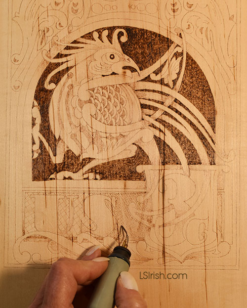
ADDING INTEREST
7. Large solid fill areas do not need to be absolutely even in tonal value work. Allow some areas to develop a slightly darker tone or paler tone than other areas to add a little extra interest to the overall area. In our sample I am darkening the background around the rooster’s head fathers and along the left side of the area where it touches the frame. This is meant to be a work of art, so remember perfection can be boring.
CROSS HATCHING
8. Use cross hatching , worked with the spear shader, set of a medium-hot setting of 5 to 7 for the US frame background. By working the background of this lettered area with a defined texture of overlapping, crossing lines I can identify the area as a separate piece or element from the surrounding elements. The cross hatched US frame is an independent subject from the solid fill rooster area of the stamp.
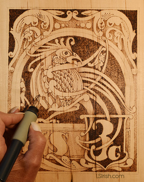
MID-TONE VOIDS
9 There is a large void area that surrounds the outer scroll work of the stamp design. Use a medium-hot temperature setting of 5 to 7, and your loop tip pen to work an open dot pattern in this area.
SEPIA SCALE CHECK
10 At this point in the burning that most of the tonal values remain on the paler side of the sepia scale. You can always darken an area later as needed. You can’t easily lighten an area that you initially worked into a dark tone.
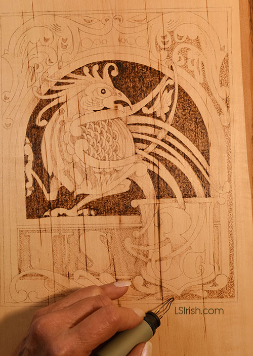
WIDEN THE TONAL VALUE RANGE
11 Widen your tonal value range by establishing several areas of solid fill black. Use your loop tool on a hot temperature setting of 8 to 10. Fill the areas with a tight scrubbie stroke. For our project these areas are the background to the 3 cent frame and the area above the top scroll design.
STRENGTHEN YOUR SHADING
12 At this point you have clearly created areas of un-burned pure white to solid fill black. Its time to strengthen your shadows and shading to fill in the mid-tone values. Working over the mapping areas worked in step 5 add more mid-tone shading to intensify your design. Note this shading still follows the simplest shadowing step of darkening an element that is underneath another element. The closer that area is to the under tuck the darker its tonal value. As you move away from the under tuck area the shading will move to paler values. Use the tool pen that you originally used for each area.
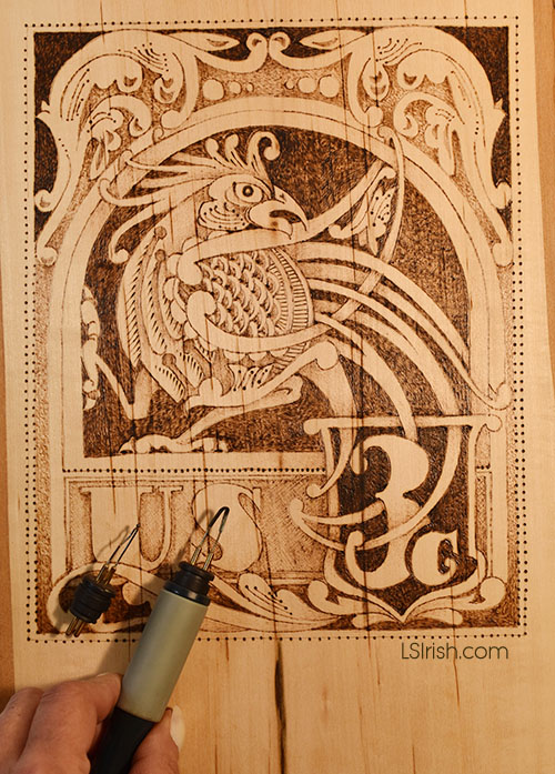
DETAILING
13 The final step in the burning of this Rooster Celtic Knot stamp pattern is to work the detailing of the design. The tonal value work that you have already done should have covered most of the outlining done in step 2. By detailing the pattern you establish crisp separation lines between elements, divide areas of similar tonal value, and give emphasis to particular parts of the pattern.
Don’t completely outline your original tracing lines. Instead work fine lines where one area needs more definition. Allow breaks in your detailing and allow changes in your tonal value so that some lines will be mid-tone while others near the black range.
For major line work, as the top of the 3 cent frame where the rooster feathers intersect, I use the ball tip pen on a hot setting of 8 to 10. The ball tip tool also is used to add the spaced dot pattern along the outer edge of the stamp pattern. For very fine, very dark, short lines as seen in the rooster’s feather work, use your spear shader on its edge in a touch and lift motion.
14 Clean your project with your white artist eraser or architect’s eraser pad to remove any hand dirt or oil. Remove the eraser dust with a clean, dry cloth. Seal the wood with several light coats of acrylic or polyurethane spray sealer.
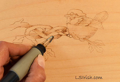
General steps to any wood burning design. As we work through the main project we will look at each step in-depth.
1. Trace or draw your pattern. On a low temperature setting with a loop tip or ball tip pen, lightly outline the pattern lines. This is just to set the pattern lines so that you don’t accidentally erase them as your hand moves across the board.
2. Map your shadows. Again, working at low temperature to create pale tonal values, begin mapping where you want your shadows and shading to fall. In general an object that lies behind or under neath another object will carry a shadow cast from the top object.
3. Make a decision about your background, void space. Will your background be left un-burned in the palest tonal value, will you burn all of the surrounding area to the pattern to your darkest black tone, or will your background to the pattern hold more design burning as the distant mountains to a barn scene.
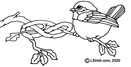
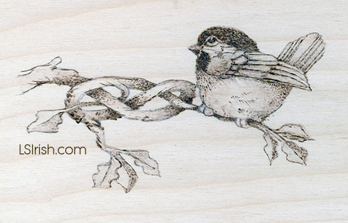
You background choice helps determine how dark you want your shading tones to be. For un-burned backgrounds as on our Celtic Branch Bird allows for very dark shading to be used directly in the design. The blackest tones are part of the burned pattern. With black backgrounds that background holds your darkest tonal value and all design work must be done in a lighter or paler value than the background. On your 1 to 10 sepia scale if your background is worked as a 10 then you pattern burning must be worked in a 9 or lower setting to it to show separately from that background.
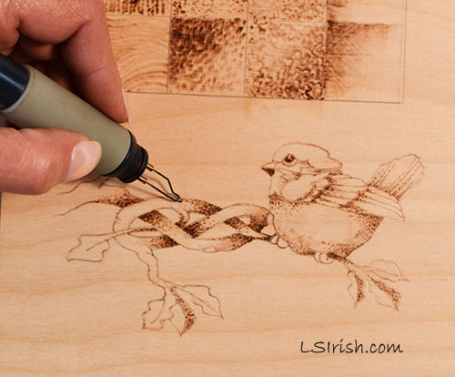
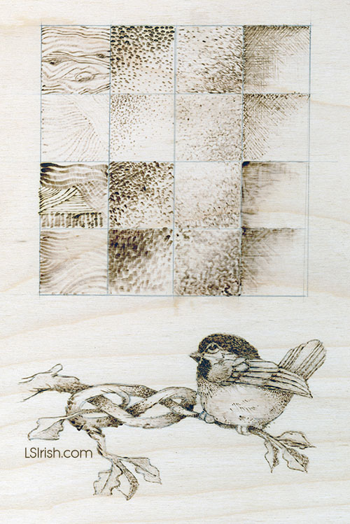
4 Graduate the shading across a full value range. Graduated shading is worked net where some areas of your design will be burned in pale tones, some in medium tones, and some I the dark tonal value range. This is where you begin to develop the three-dimensional look of your design using the different pen tips and pen strokes. For our Celtic Branch Bird this includes a hot temperature, dot pattern burn on the branches using the ball tip pen. The belly area of the bird is worked in a pull stroke using the spoon shader, and the leaves have a soft, scrubbie stroke on a low temperature setting using the loop tip.
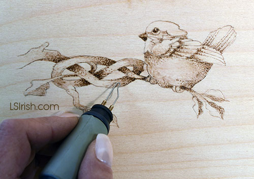
5 Create areas of contrast. As your design develops you will need to establish both extremely pale areas inside of the burning as well as the darkest tonal values. You only need a few spots of each white and black value to create a strong contrast. For our bird the white highlights are under the eye, the center tail feather, and the top of curve of wood in the knot patter. Our black tones are the eye, the cap and the deep underneath curves of the wood knot.
6 Add your details. Details are not outlines. They are small sections of an area that is re-enforces with a thin, fine line. Some areas of your burn may need no detailing as the tips of the tail feather for our bird. In other areas use a changing, thick to thin line as around the edges of the leaves. Allow a few areas of your design to have neither an outline or detail … just let the tonal value work stand on its own.
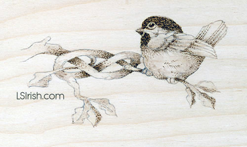
7. Clean and finish. This little practice project is complete in the burning steps and ready to have any tracing lines or hand dirt erased with an artist eraser, gum eraser, or architect’s pad. You can add coloring through the use of oil paints, water-thinned acrylic paints, or colored pencils to the work. Finish with either an oil finish or spray sealer finish, following the directions of the can.
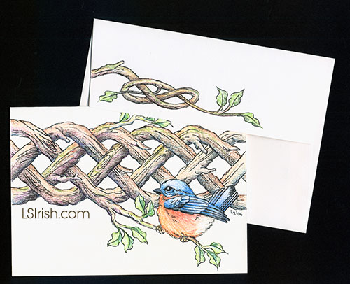
This is our the same Celtic Knot Blue Bird design that we have been exploring as a birch plywood burn. In this sample the burn was worked on heavy-weight art-quality writing paper and matching envelope. Color was added using colored pencils, and the work set with a light coat of matte spray sealer.